Wimbledon Fan Experience.

Overview.
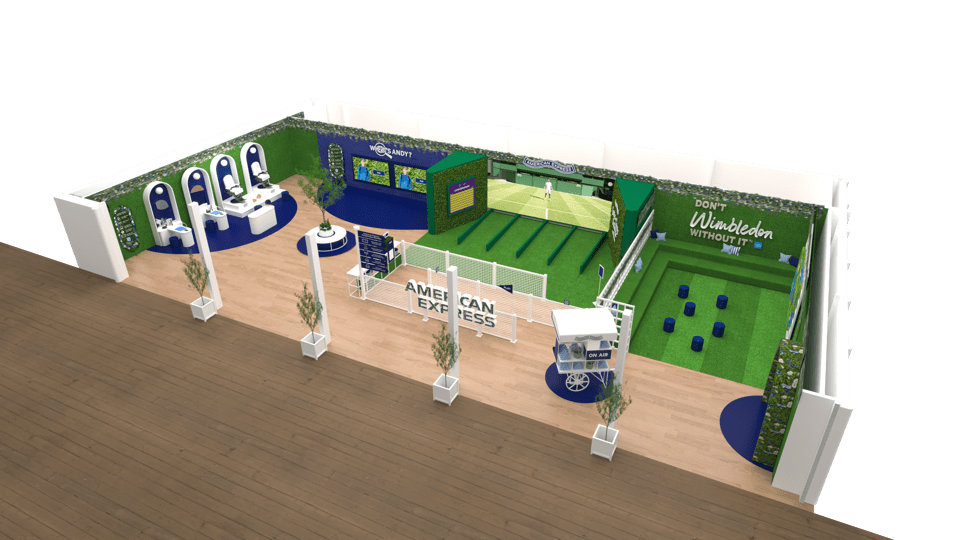
In celebration of the unsung heroes of the Championships, the ball boys & girls (BBGs), we empower fans to find out what it takes to make the grade at Wimbledon, through a fun, interactive and physical activation where fans get to step into their shoes.
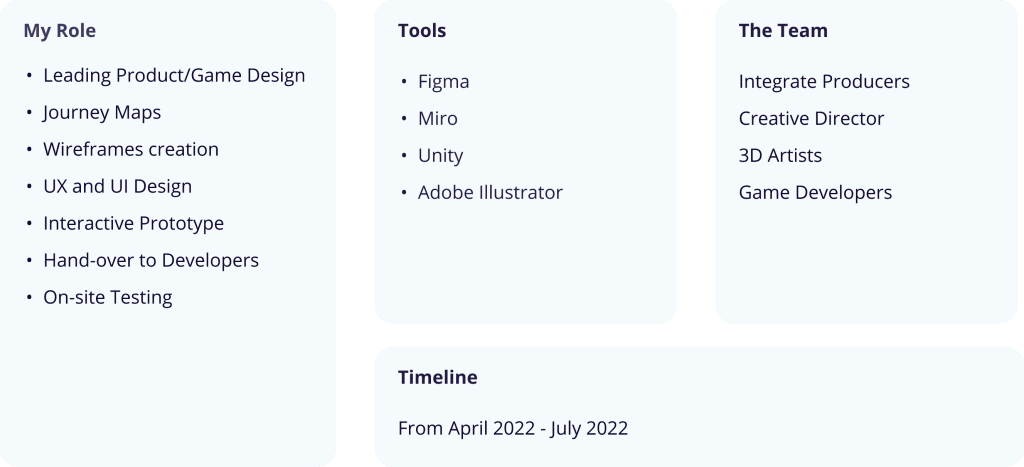
Role and the Team.
Centre Court Challenge Game.
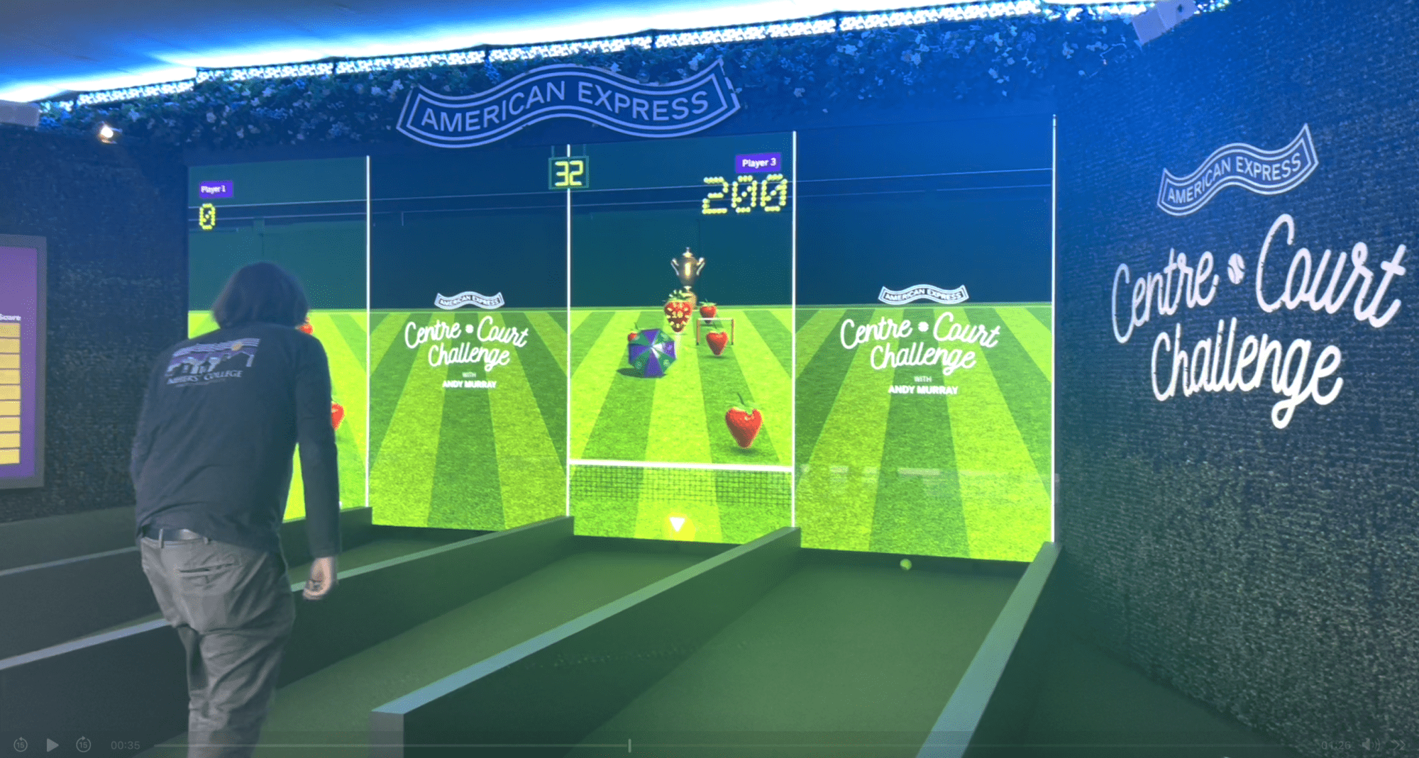
We give fans the chance to see what it takes to be a ball boy/girl at the AELTC.
How does it work?
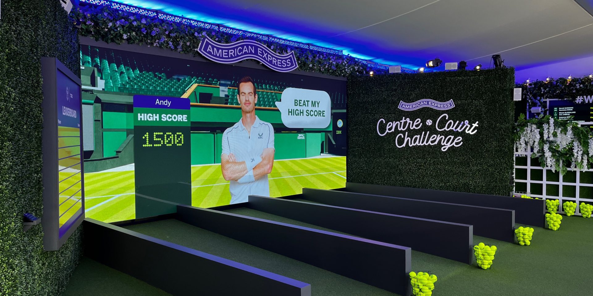
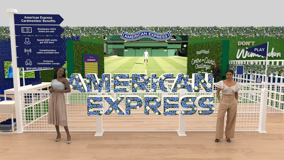
1–4 competing fans are challenged to roll physical tennis balls as accurately as possible to register an on-screen target. The more accurate the roll, the more points are scored, and the winner is whoever gets the most points in 60 seconds. The action takes place on Centre Court, with Andy overseeing the fun and offering words of encouragement.
- Competitive 1-4 Player Game – The excitement of competing against those in other lanes but with ‘rubber banding’ (and other techniques explained later in the doc) so those who don’t do so well stay competitive. The screen-based feedback needs to somehow show the competitive element by comparing the players against each other. Either 1 or up to 4 players can play the game at once.
- Physical Input based on accuracy – That works/feels well with the game so the players understand when they have made a mistake/missed the target or when they have done well. There should be no ambiguity for players where they hit
- 60-90 Seconds of Gameplay – With excitement building towards the end of gameplay. How long for introduction and other states?
- Players have scores – that can be added to a written leader board, compare against Andy
- Fun for everyone – The game feels good for everyone, the skilful players understand they are doing well, and the weaker players are given enough exciting feedback to make it feel like they are doing well.
The Game Strategy.
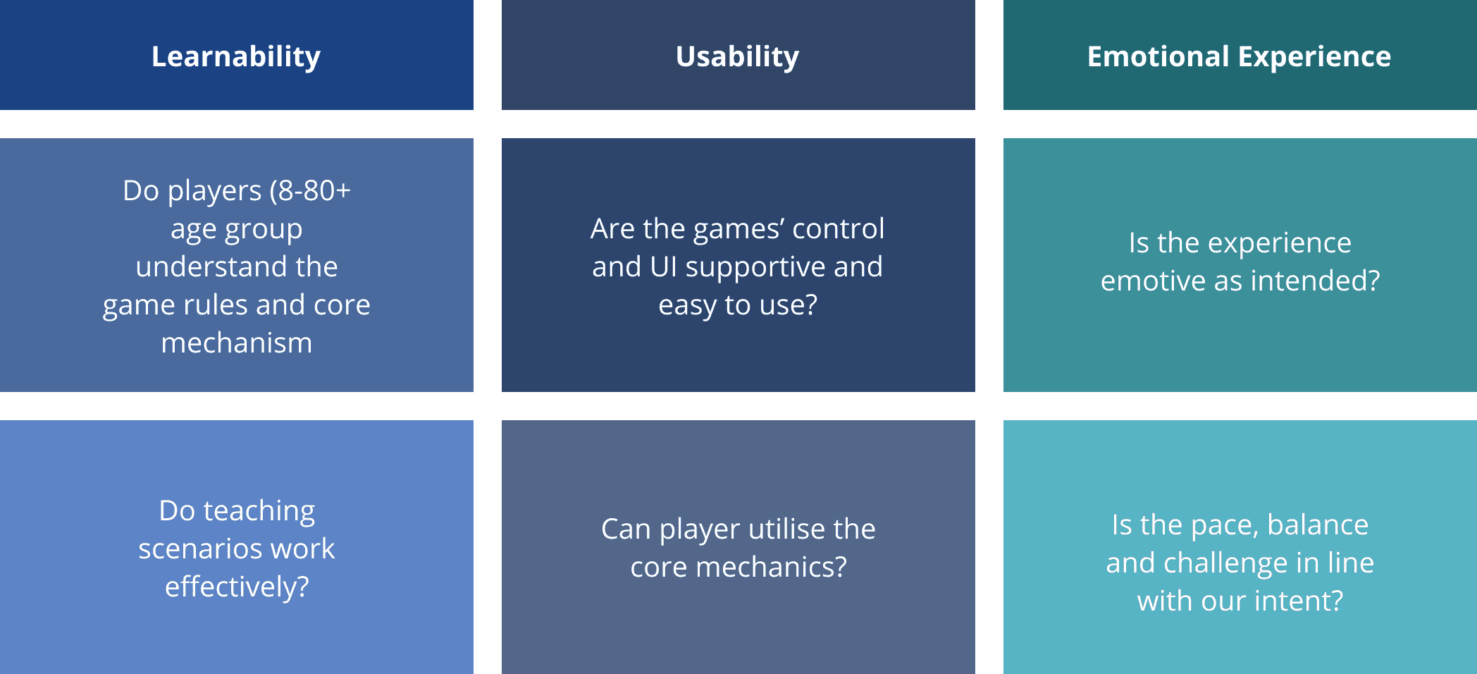
The method of Learnability, Usability and the emotional experience was considered for the game development.
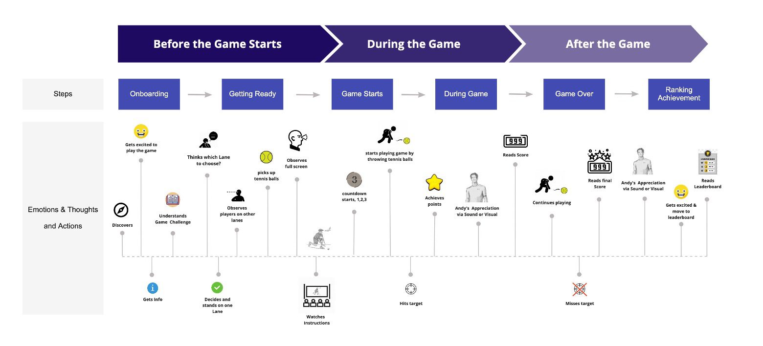
User Journey Map.
Flow Map.
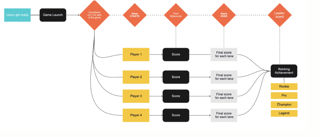
A basic user flow map was created to give an overview for the team to understand the game process.
Sketches.
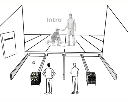
Split screens.
As a team, we discussed the idea of splitting screens. The pros and cons of splitting the screen were as the following:
Pros
- Each player gets a clear view of their own lane.
- Allows special camera animations for each player.
- More user friendly
- Removes perspective problems of a single overhead view.
- Own score in each lane
- Less distracted
Cons:
- Potentially confusing/cluttered view for spectators.
- Andy Murray may be either: not visible, or… duplicated and visible on multiple screens simultaneously
- If Andy Murray appears to give feedback to the player he may obstruct the action.
- Additional technical implementation required.
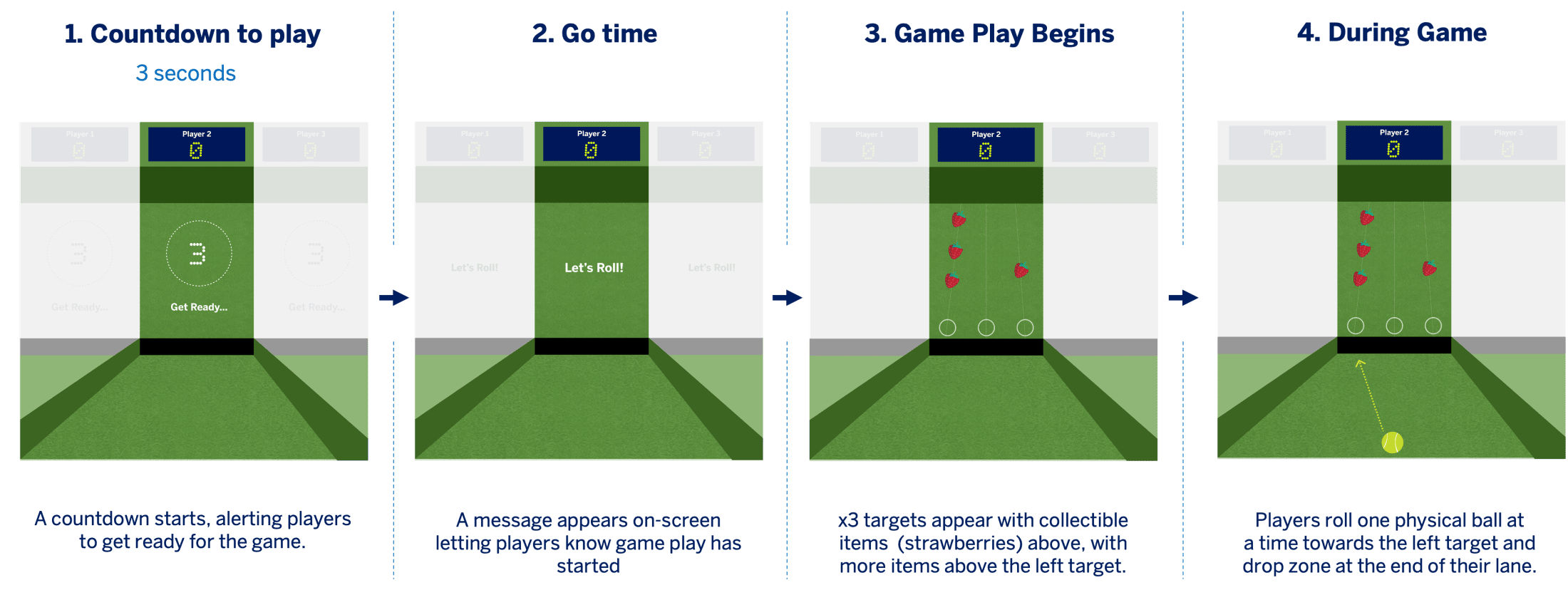
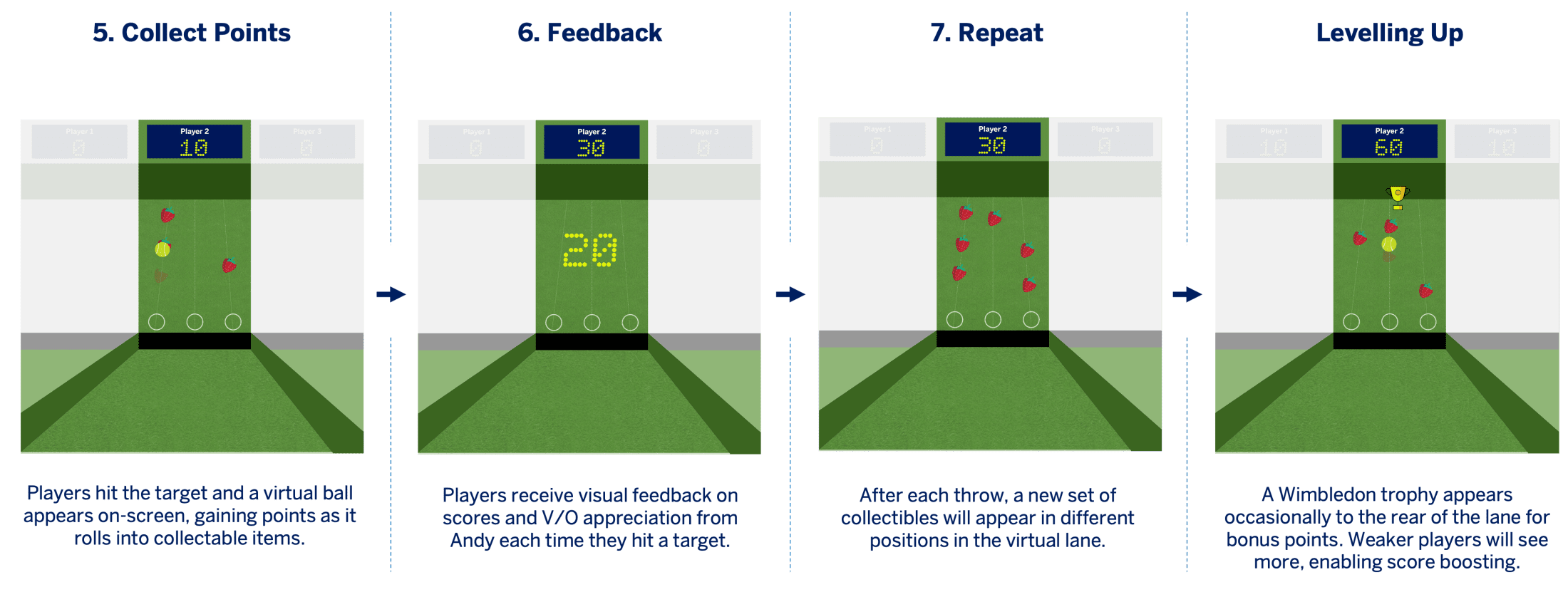
Storyboard of the game.
I managed to create this storyboard of the game which helped the game developers understand the flow and opportunity to further generate game ideas.

Game User Experience.
Games User Experience is a discipline of science and design for overcoming the difficulties in making games that deliver on their experiential intent. UX foundation in the sciences — Cognitive and Experimental Psychology — do provide some means to explore players’ motivation, emotion and satisfaction.
Keeping players hooked in engagement loops: this concept follows a simple three-step cycle—motivation, action, and feedback— and this concept is applied to UX design.

"Find Andy" Game UX and UI Design.
Overview
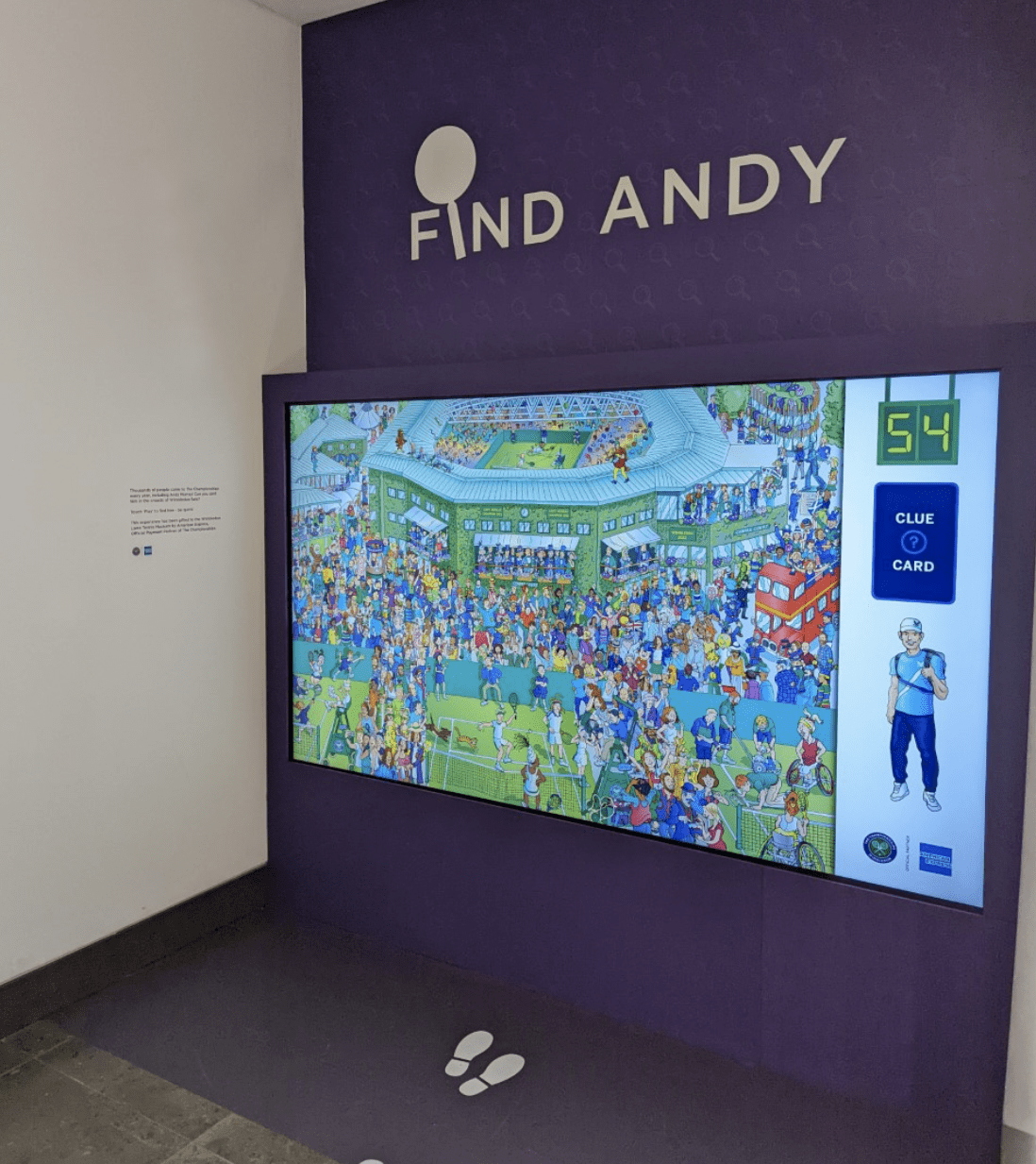
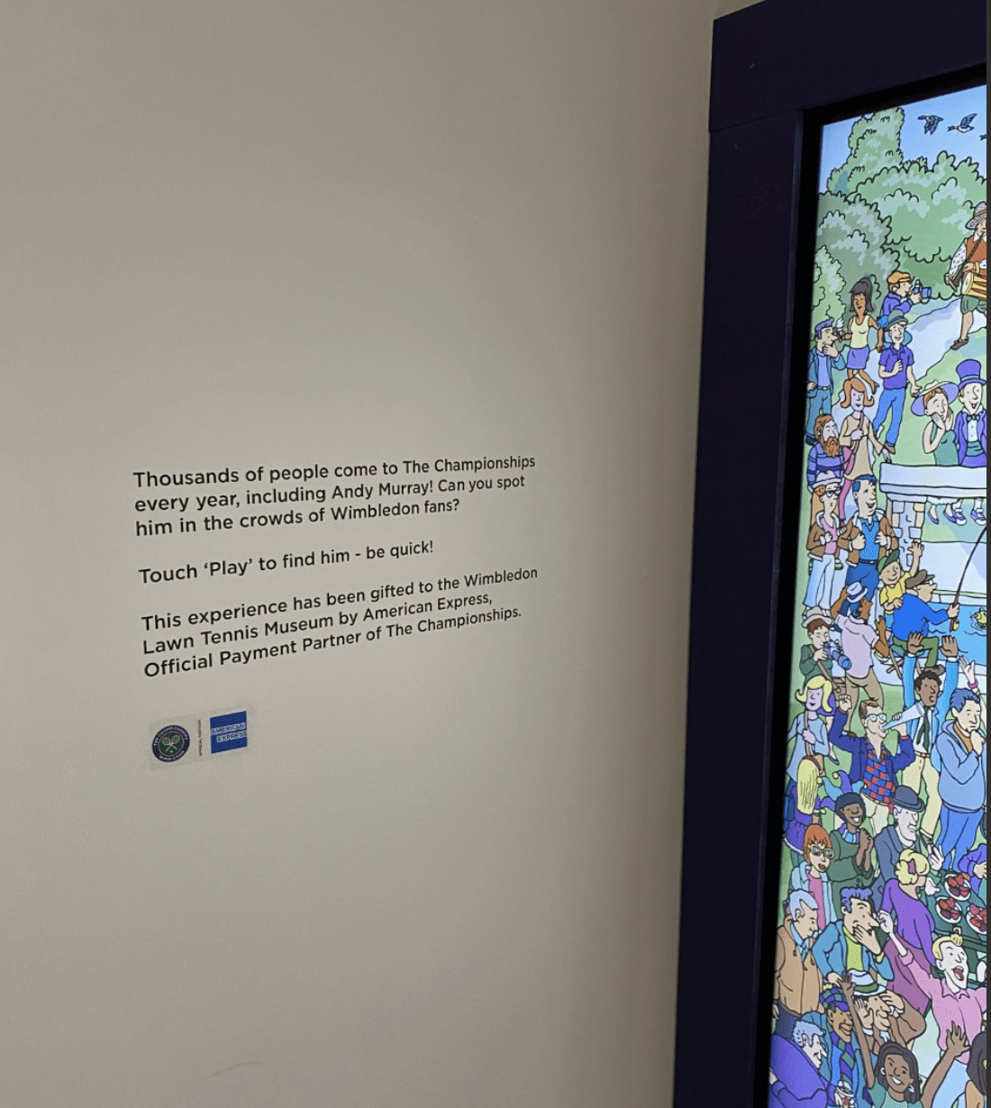
Fans can play ‘Find Andy’, Andy appears on-screen in front of a green hedge wall, to help welcome fans. Andy’s actions switch between every gameplay, from waving fans over to walking across the screen holding a map.
Discovery:
The initial phase was to understand the project requirements, goals, and objectives. The research involved the target audience and gathering insights into the Wimbledon event.
Ideation and Conceptualization:
My team managed to create a list of ideas and concepts that we could use to create an engaging and interactive game. We brainstormed ideas and made sketches for the possible game flows, interfaces, and interactions.
Wireframing:
The next phase for me was to create low-fid wireframes to visualize the game’s structure and flow. These were created to ensure that the game is easy to navigate and the interactions are intuitive.
Prototyping:
During the last phase, I designed a high-fidelity prototype of the game, and the interaction and user experience was tested by the team. We also managed to do user testing to get some feedback and make necessary improvements.
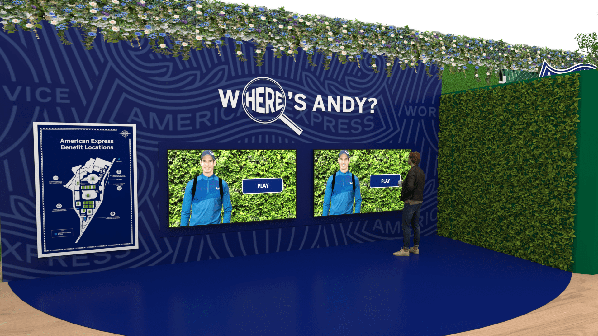
Initial ideas for the game
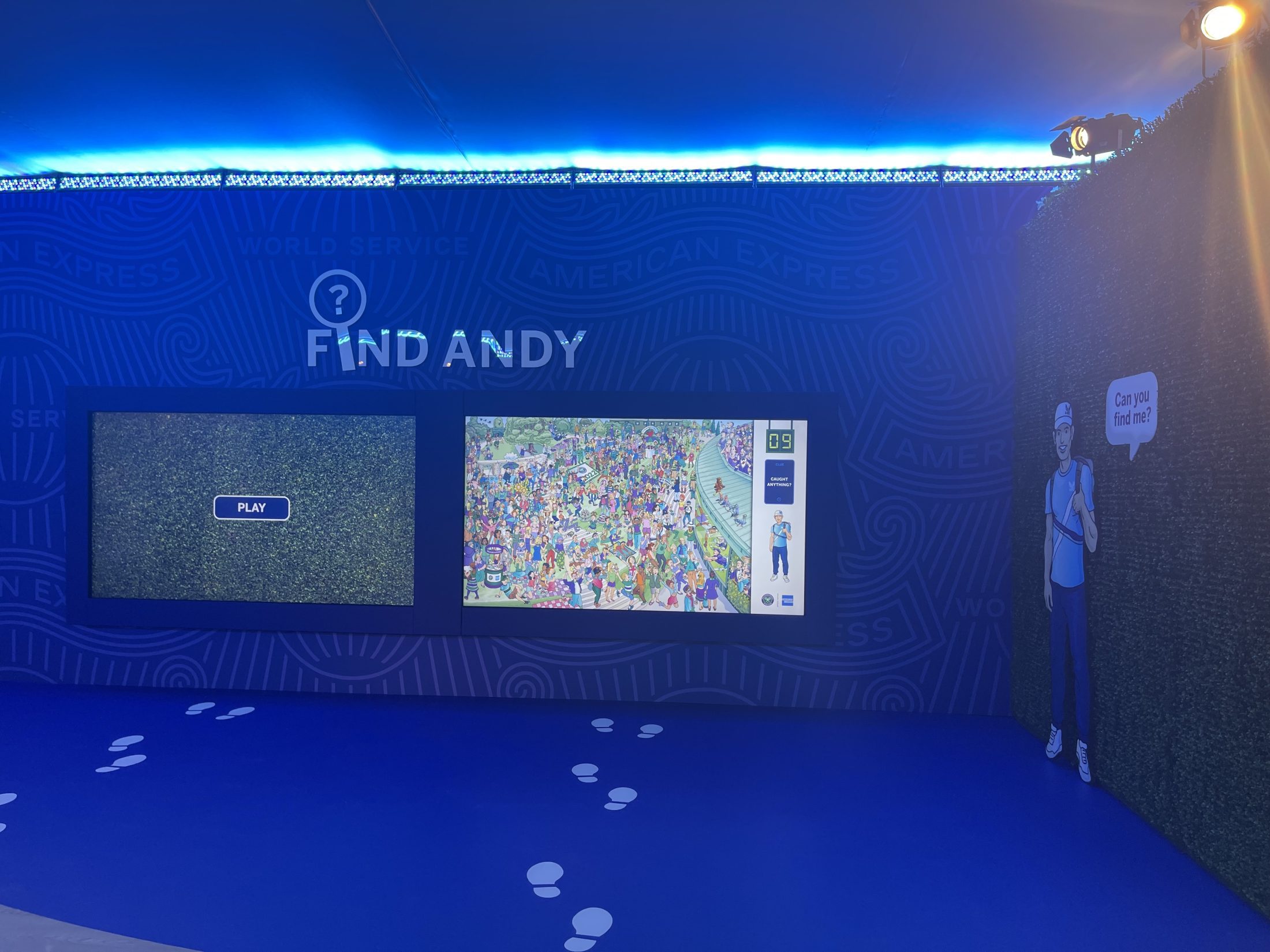
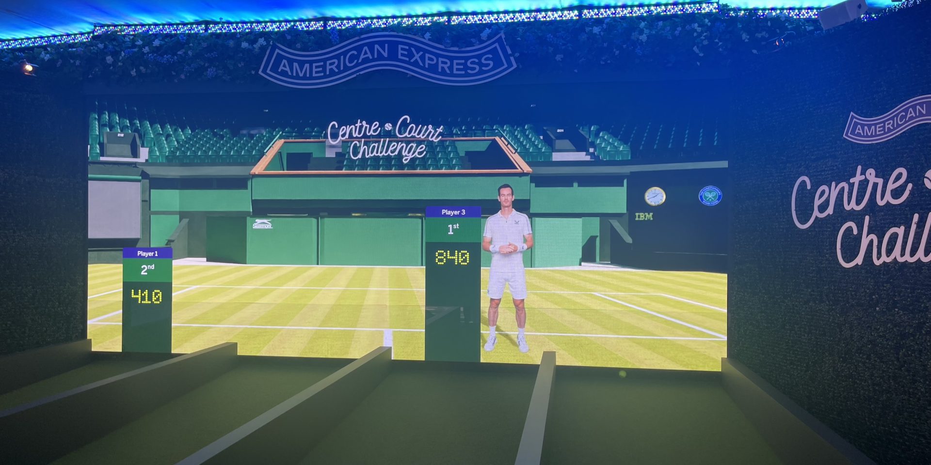
The final setup of the game at Wimbledon 2022
"Find Andy" in the Museum.
