Whitebox VXI VR.

Overview.
WhiteBox – a hybrid experience platform,
to bridge the gap between IRL and virtual events.
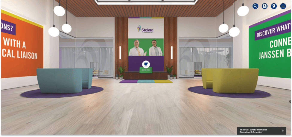
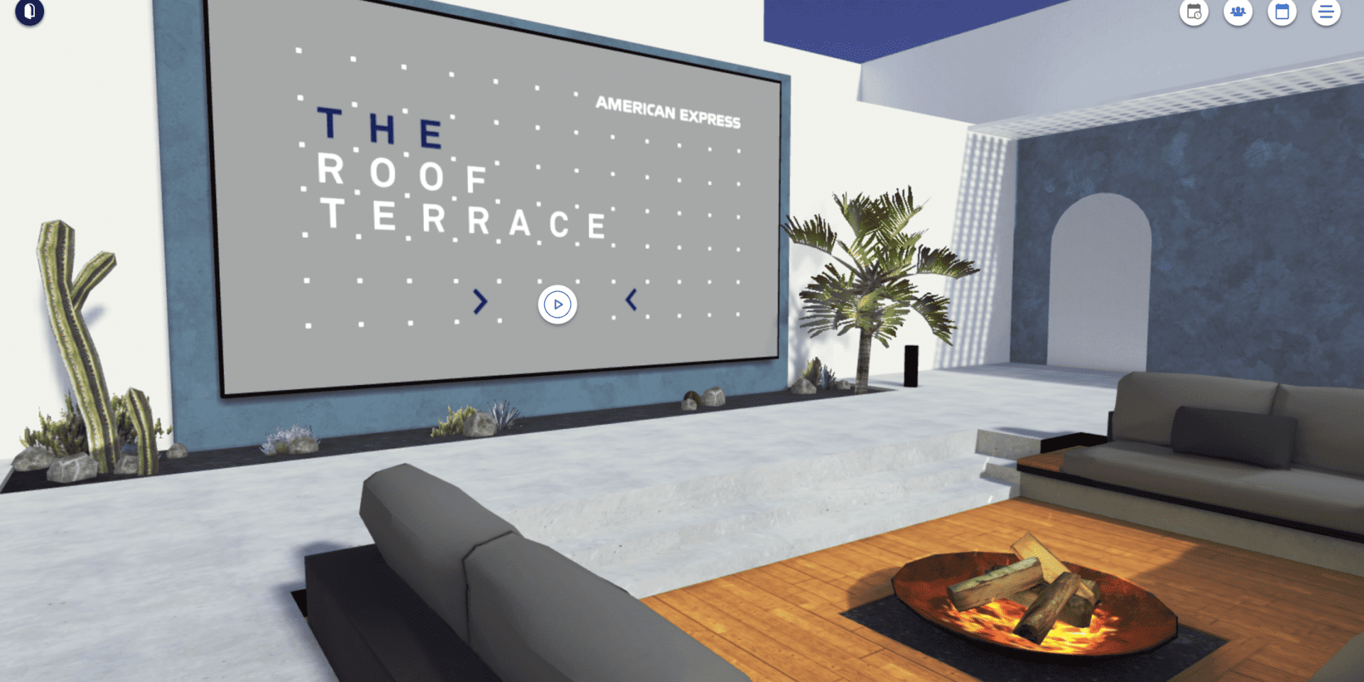
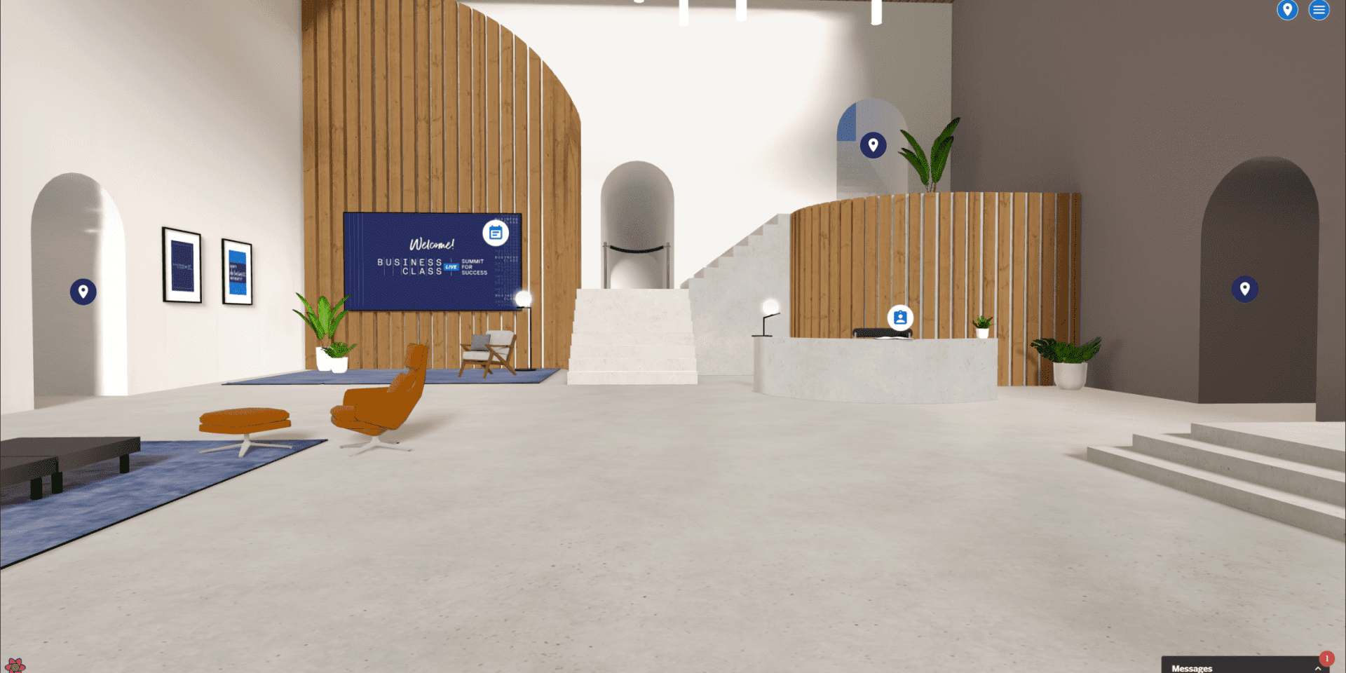
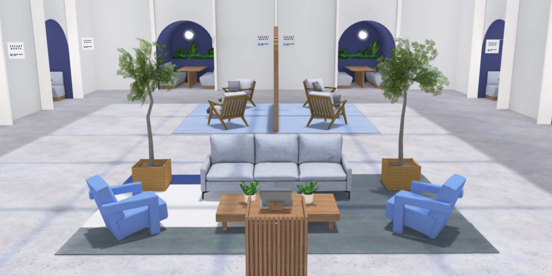
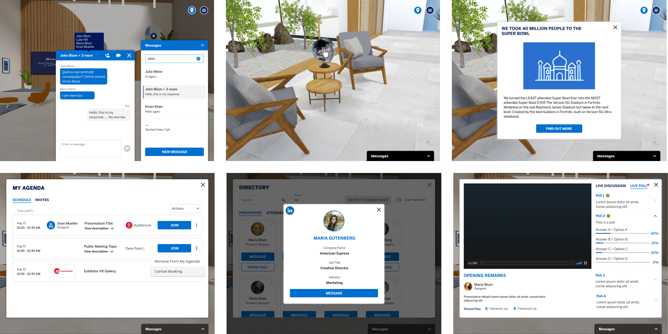
WhiteBox VXI is a generic virtual events platform built by Momentum Worldwide, that can be adapted to fit the branding of any client. WhiteBox VXI allows interaction in a 3D environment through the ‘Auditorium’ and offers live networking; break-out rooms and one-to-one meetings can take place, all with fully integrated video conferencing.
The platform also offers a bespoke creative environment which elevates brands’ content along with easy guest registration and a personalised agenda system.
VXi for Brands.
Whitebox is a bespoke creative environment to elevate branded content, easy guest registration and a personalized agenda system. Whitebox is adopted by a number of brands including American Express and Janssen, Redbird, McCann Worldgroup and more. The platform is designed to support events with 50 to 50,000 attendees.

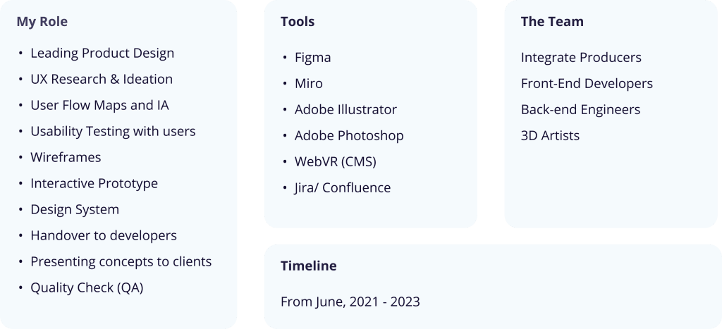
My Role and the Team
The BASIC Framework.
The objective of redesigning the platform was to adhere to the standard of user-centric design principles. The aim was to conduct proper usability testing with the end users and get valuable feedback to improve the overall user experience and UI design. Another objective for the redesign was to document design and development and create a design system as a baseline for all future VXi projects and potential clients.

Virtual real-life conference.
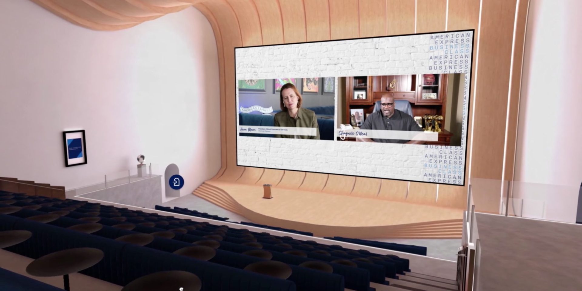
WhiteBox’s features mimic a real-life conference with a virtual “Auditorium” where people can interact with “in real life” content, and a “Penthouse” featuring break-out rooms and a space for one-on-one meetings using video conferencing.
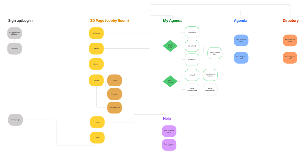
Information Architecture.
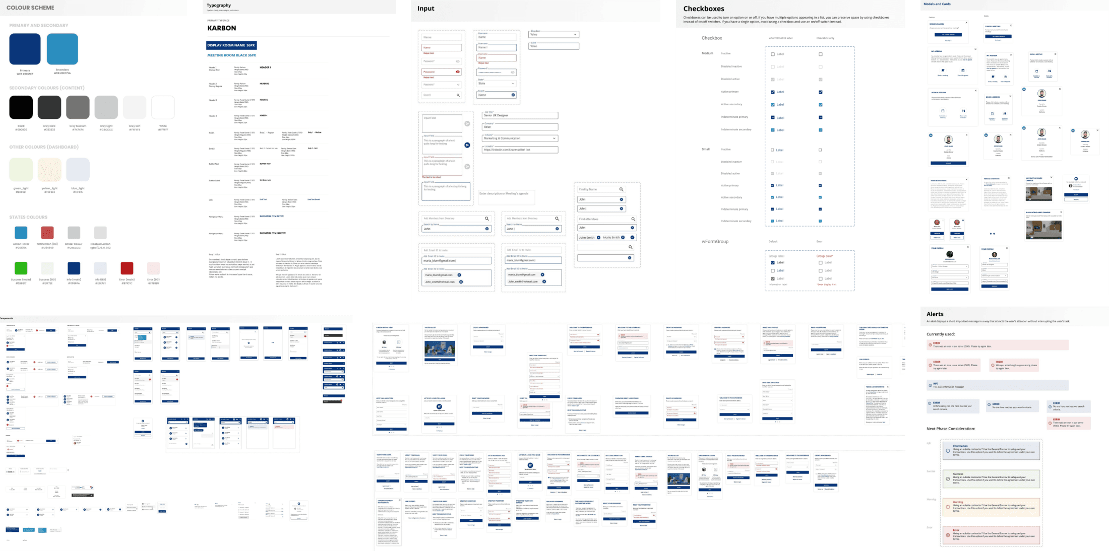
The Design System.
The aim was to establish a design system for better communication and alignment with front-end developers and engineers.

Solving Problems.
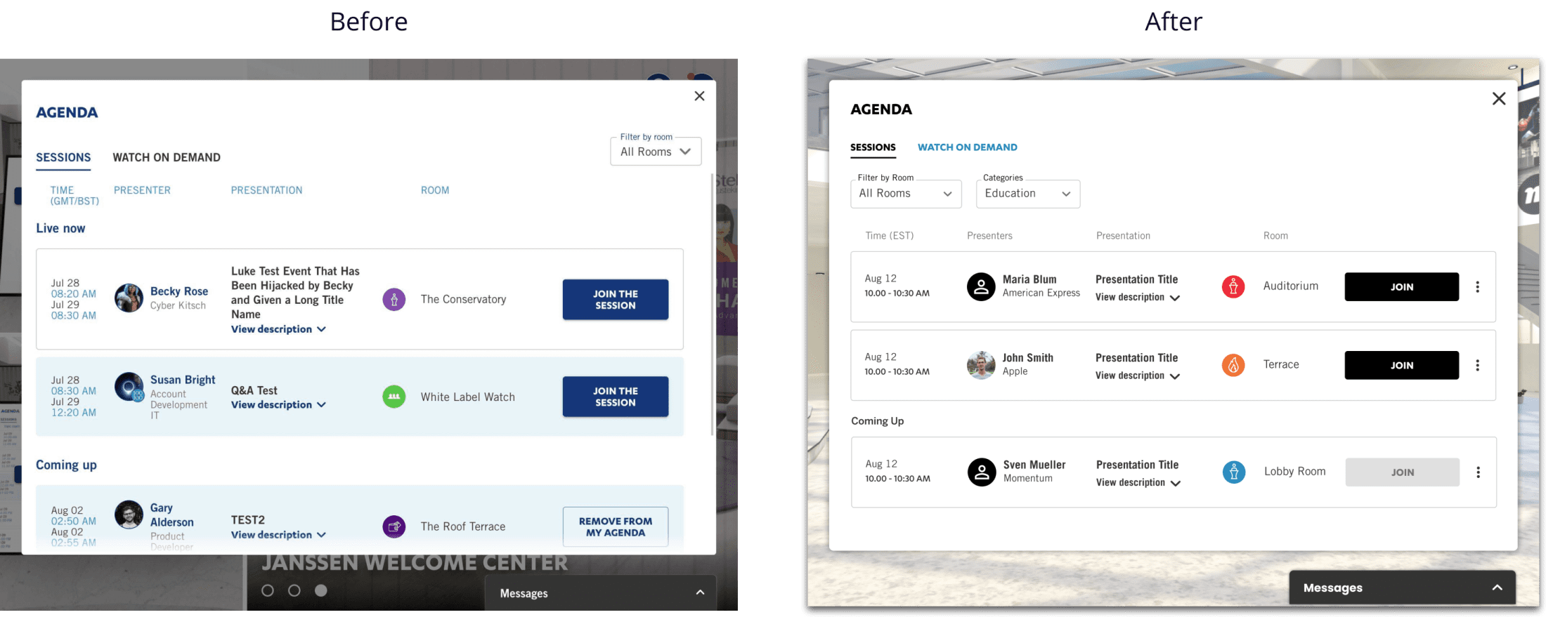
UI Redesign.
The Whitebox UI was redesigned according to the standards of WCAG (Web Content Accessibility Guidelines).
Visual Hierarchy and using WCAG helped increase the overall accessibility of the product.
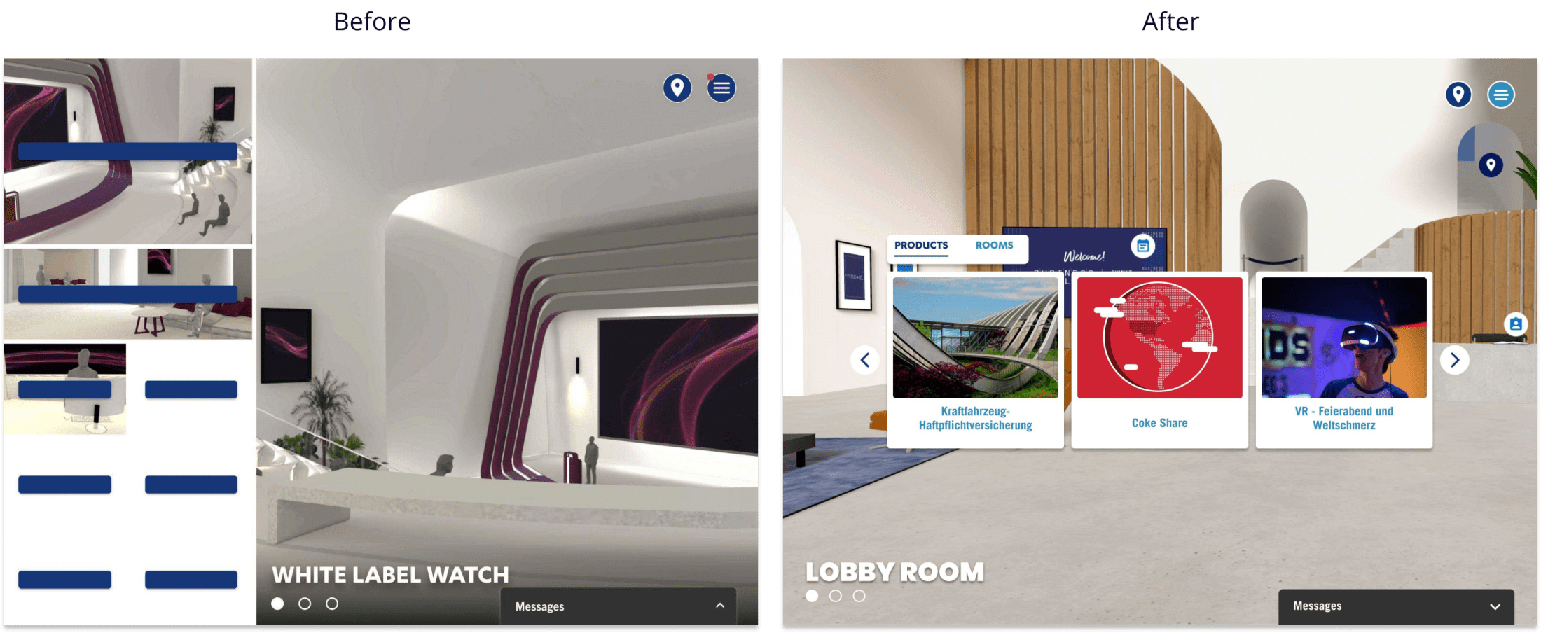
2D Mode Landing-page Redesign.
The 2D Mode landing page was before the redesign pointless, confusing and had bad UX for users. Elements shown on the left side were links to 3D environment pages and products. The problem was adding more than 8 items/links was impossible. After redesign; categories were set in tab bars, links to pages were displayed as a gallery and a navigation button was added to navigate through a number of items as a slider view.
Video & Conference Call Settings.
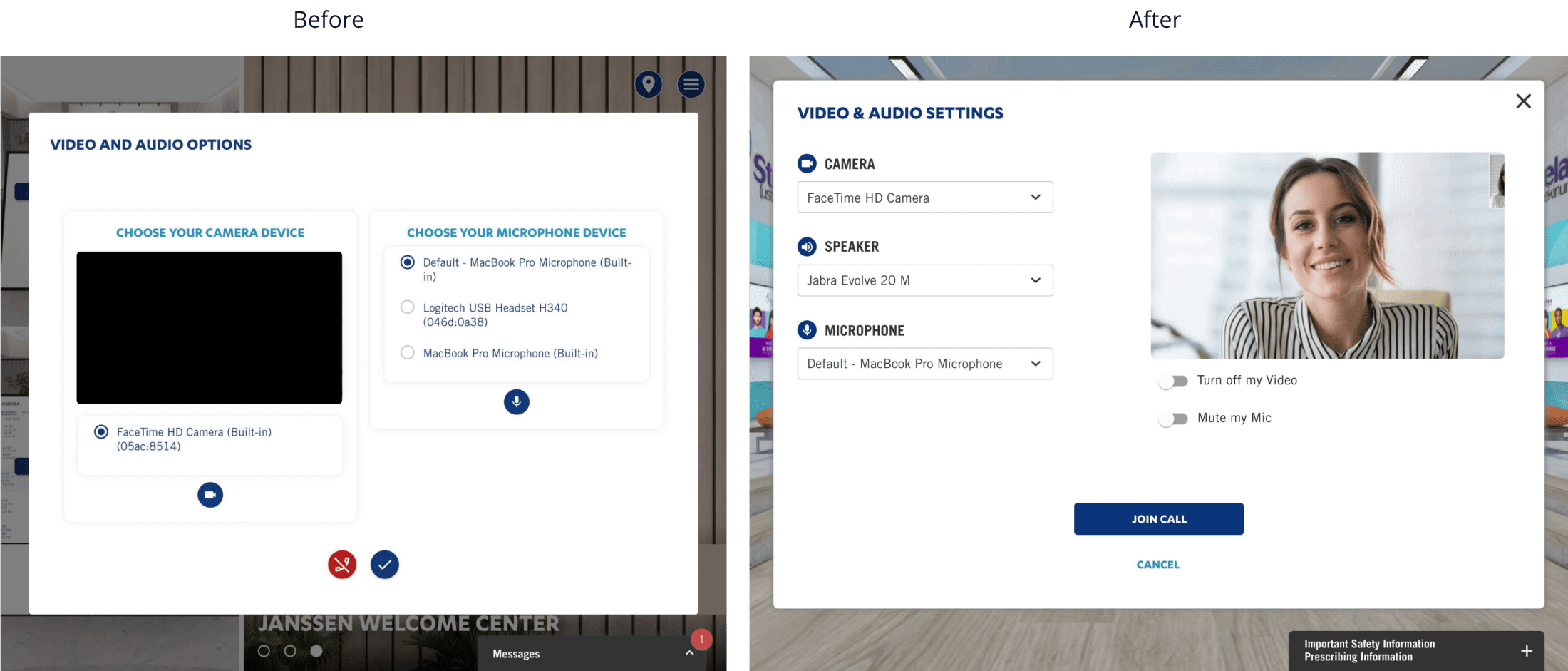
Video Call and Conference UI was redesigned to make it user friendly and intuitive interface.
UX Redesign and Improvements.
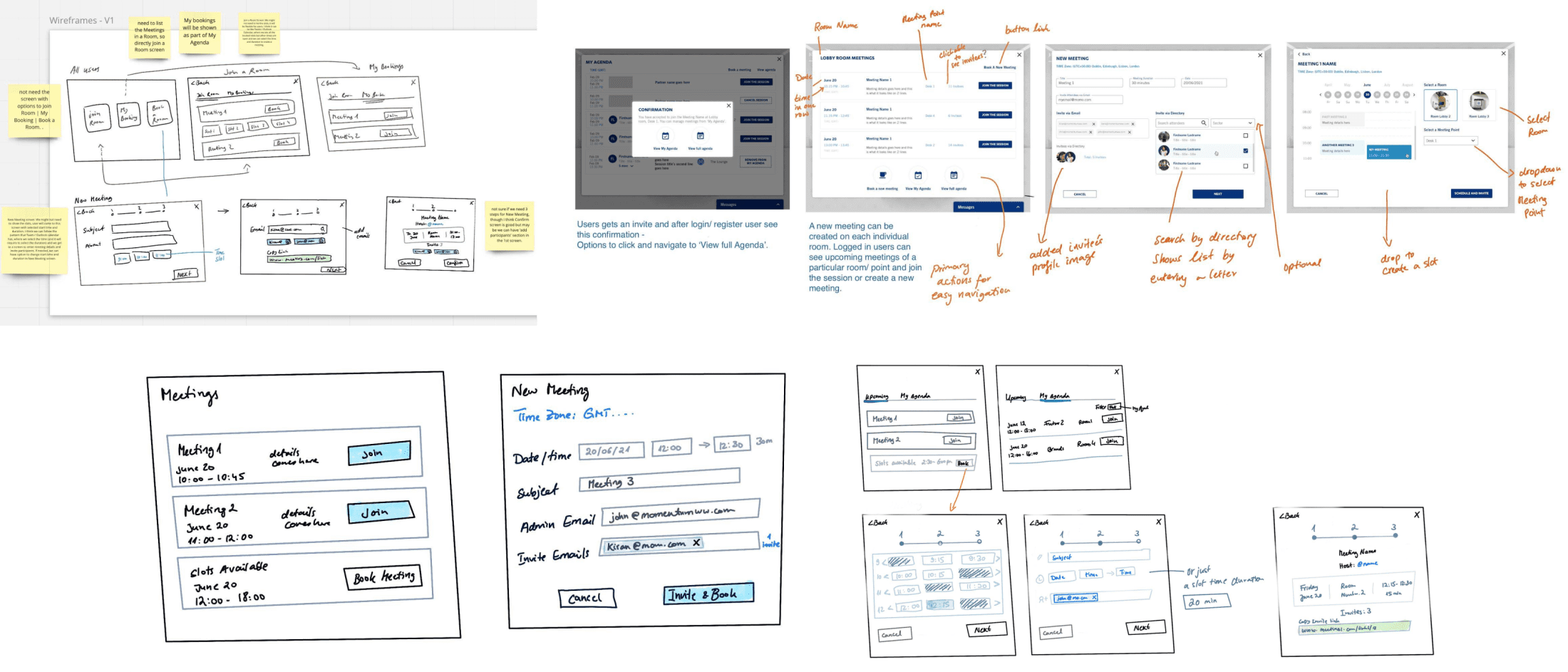
Janssen Schedule System.
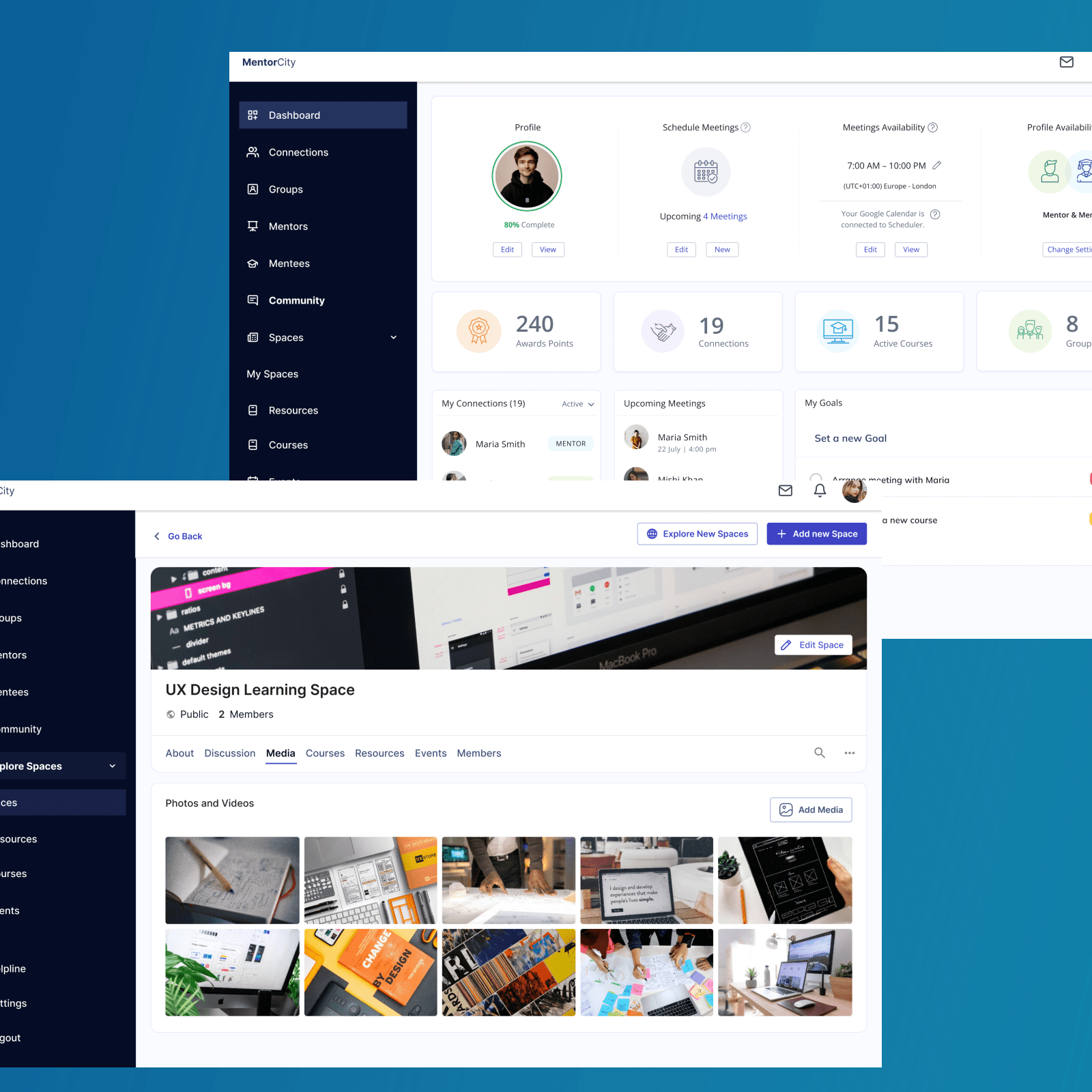
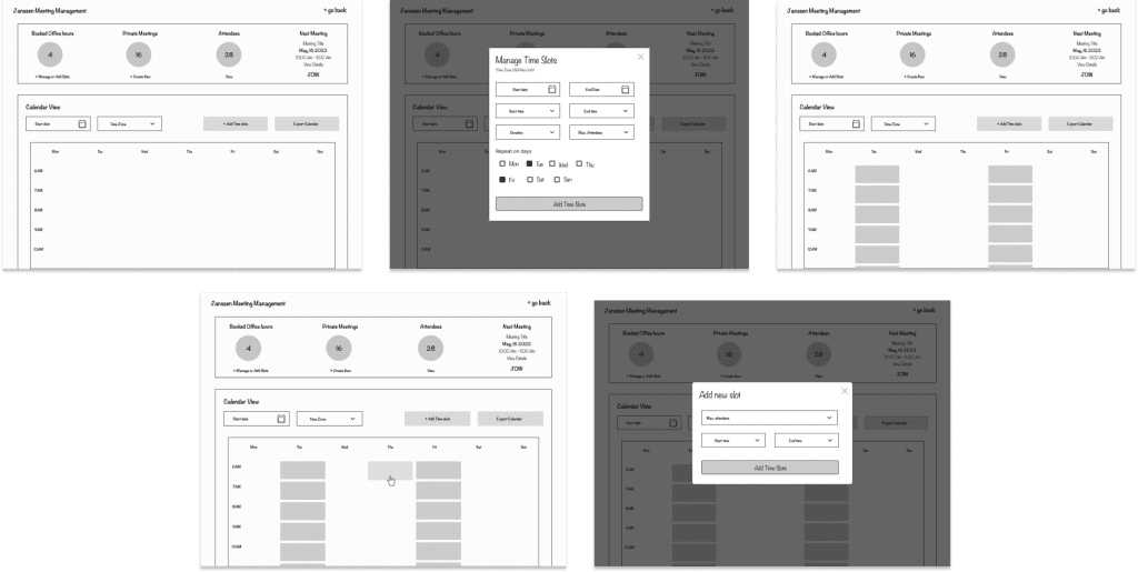
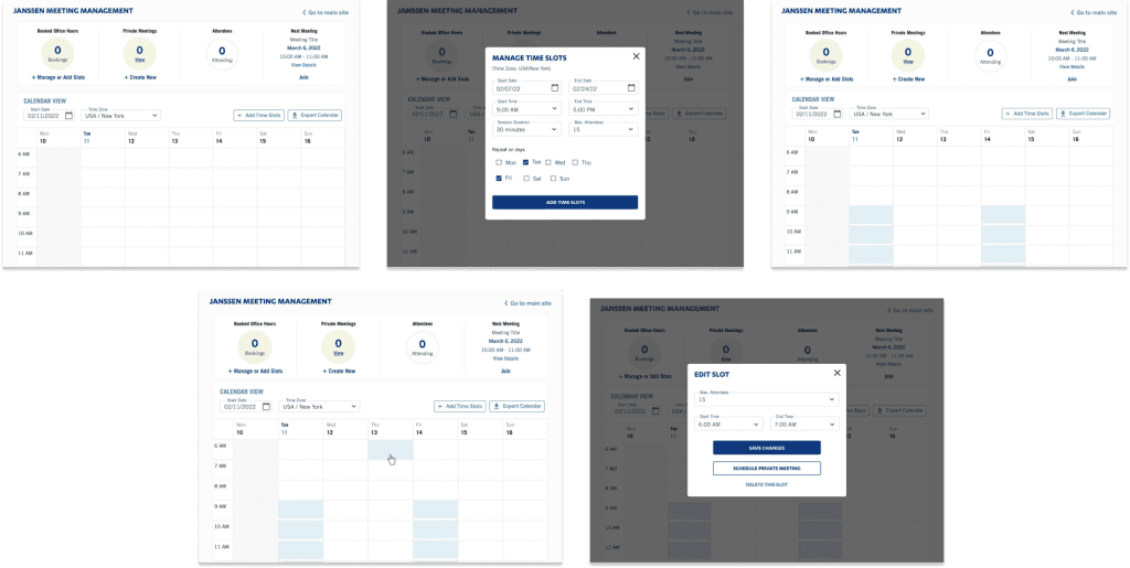
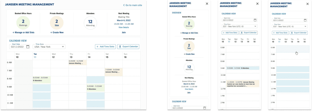
The objective of adding a new feature of scheduled meetings was to design a solution for medical practitioners who need to schedule regular 1-2-1 sessions and manage their meetings. The aim of the UX audit was also to increase accessibility, readability, adhere to the web standard guidelines, and usability and provide the best user experience.
Dashboard System - Low-Fidelity Wireframes.
Understanding Janssen’s primary goals and objectives was the key,
which enabled me and the team to take proper measures to help them
to re-envision their current VXi web experience.
Dashboard System - High-Fidelity Wireframes.
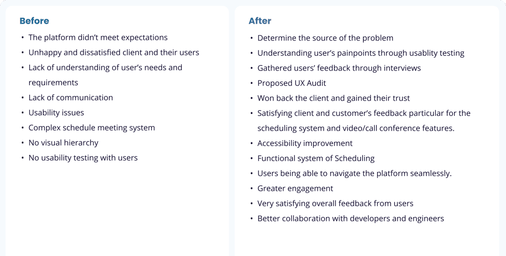
Product Design Measurements and Impact.
