Case study · Uniti · Networking app
Let’s get connected.
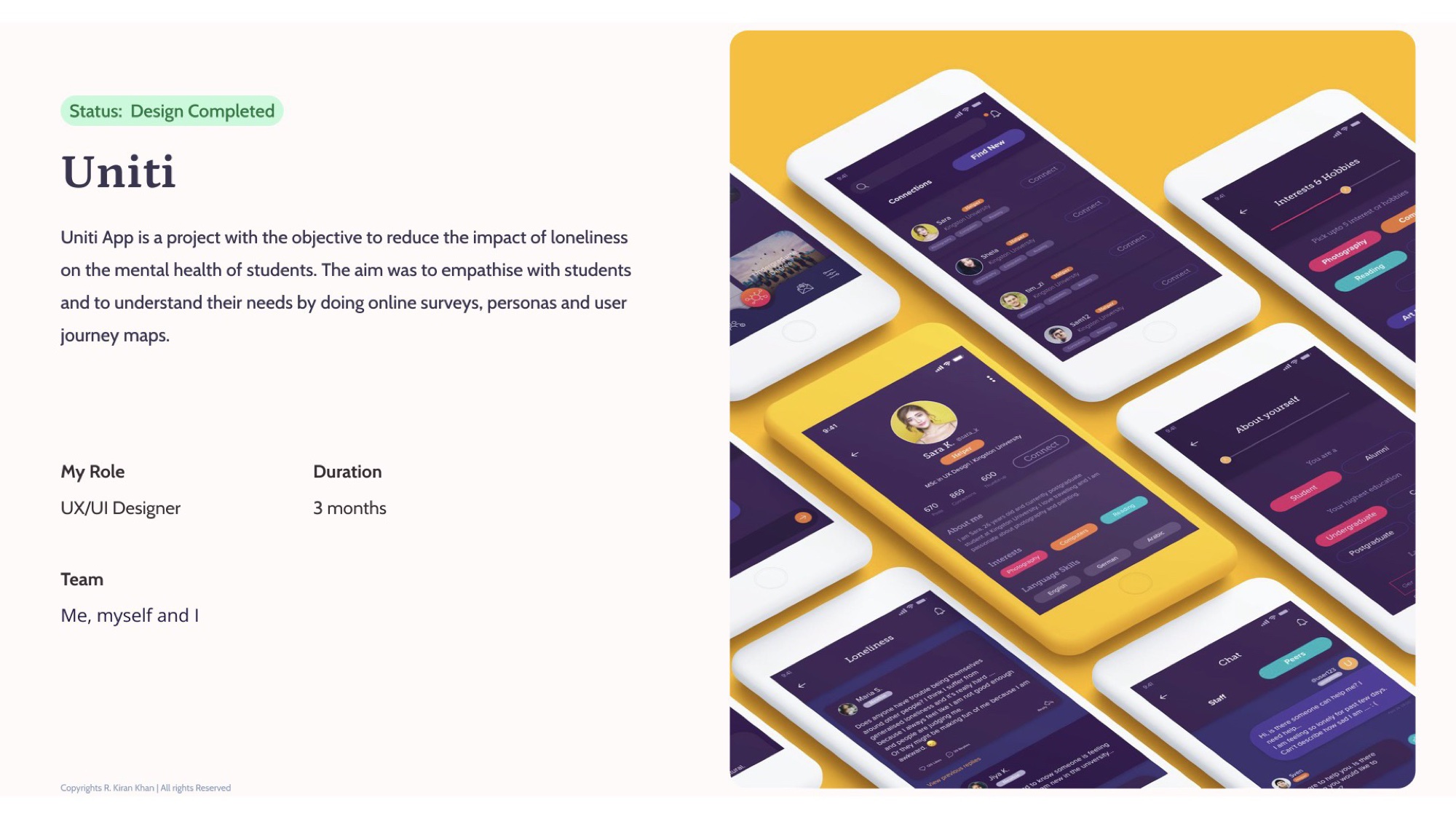
UX/UI Designer on Uniti — a mobile app built to reduce the impact of loneliness on the mental health of students. Solo, three months, end-to-end — from online surveys and personas through journey maps, low- and high-fidelity prototypes, and the dark purple-led UI you see here.
- Role
- UX / UI Designer
- Team
- Solo · me, myself & I
- Duration
- 3 months
- Status
- Design completed
The brief
An app that earns reaching out.
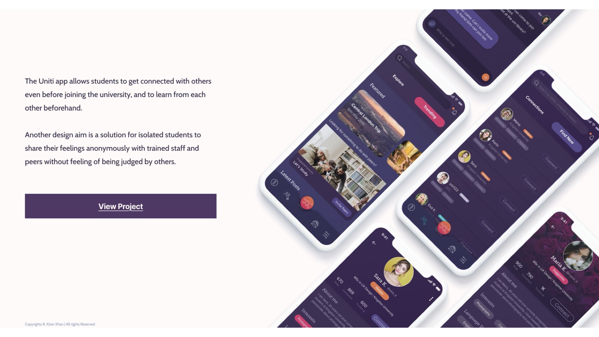
Student loneliness isn’t a niche issue — it’s a load-bearing one for mental health. The aim of Uniti was to empathise with students, understand their needs through online surveys, personas, and user-journey maps — and then build an app that earns the moment someone decides to reach out.
Aims
Three aims, anchored in research.
Each aim came directly from what surveyed students were telling us they couldn’t do today — and what would have changed their first year if it had existed.
- 01
Reduce the impact of loneliness on the mental health of students.
- 02
Connect students with peers before they even arrive at university — so community is already there on day one.
- 03
Give isolated students anonymous channels to share with trained staff and peers, without fear of being judged.
Process
Four moves, end to end.
- 01
Empathise through surveys
Online surveys with current and prospective university students mapped where loneliness actually starts — what isolation looks like, what students avoid, what they wish existed before they arrived on campus.
- 02
Build user personas
Two persona archetypes emerged from the research — capturing distinct routes into university life. Every subsequent design decision tested against both of them.
- 03
Map the journeys
User-journey maps from pre-university through to first semester surfaced the friction points where loneliness compounds — pre-arrival uncertainty, first-week overwhelm, the unsaid struggle of asking for help.
- 04
Iterate from low to high fidelity
Multiple rounds of low-fidelity wireframes before two phases of high-fidelity mockups. Formative evaluation between phases refined the navigation, the dark / purple-led aesthetic, and the safety scaffolding around the anonymous channels.
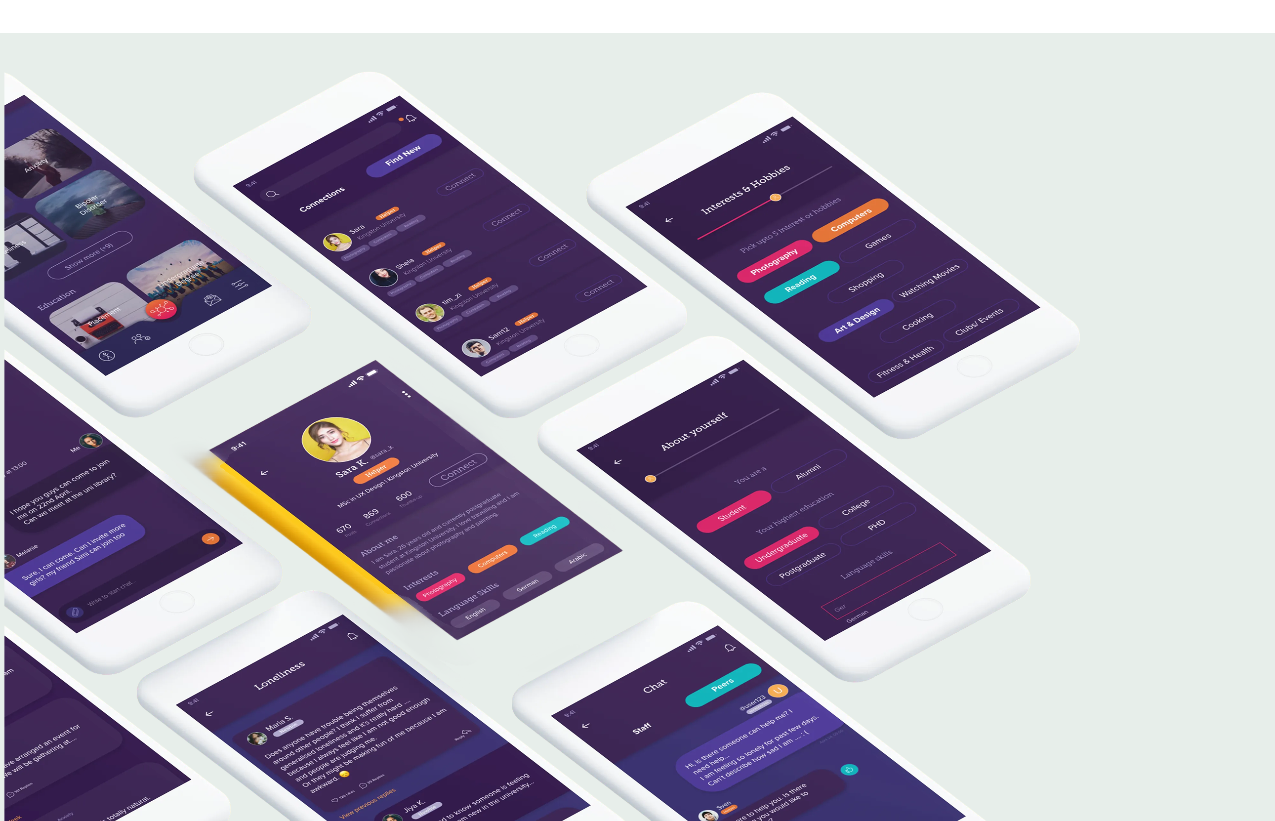
Surfaces
Three surfaces, one job to do.
Every screen feeds one of three jobs — finding someone, reaching someone, or doing something together.
Pre-university connection
Profile-led discovery so students can find peers who share interests, languages, or course paths — and start a conversation before move-in day. Profiles surface interests, language skills, and a clear opt-in role: Helper or Supporter.
Mental Health & Helpline
Dedicated routes to anonymous chat with trained staff (the Helpline) and peer Supporters (Mental Health). Anonymous by default, with a clear trust signal — Helpers and Supporters are tagged so students know who they’re talking to.
Explore, Trending & shared activities
Lightweight Explore and Trending surfaces around local events and shared activities — “Looking for something to do with peers?” — so connection has somewhere to land beyond chat.
Design rationale
Three principles, every screen.
Connection first, content second
No public feeds, no follower counts, no streak guilt. The app exists to put two students in a low-stakes conversation, not to keep them scrolling.
Anonymous when it counts
Dedicated anonymous channels for the harder conversations — with trained university staff, and with peer Supporters who’ve opted in to listen.
Calm by default
Deep purple surfaces with warm accents reduce visual noise and signal the app isn’t fighting for attention. The UI gets out of the way of the conversation.
Reflection
“A networking app for loneliness isn’t a contradiction — it’s the point. Uniti was designed to make reaching out feel like a normal first move, not a last resort.”