The need for websites to be ‘responsive’ impact on web design
The impact of how the websites have to be ‘responsive’ with regards to the usage on mobiles, it is important to understand certain concepts such as responsive websites, native apps, and hybrid apps, and the difference between the designs along with their impact on user experience. But in this article, I am going to discuss mainly responsive websites.

The current advancement of technology, the popularisation of mobile devices and the access to the Internet has made it possible to carry out various activities, from access to the electronic commerce to the use of banking services or making purchases through online store. All this can be done quickly and comfortably at anytime and anywhere.
These devices, however, have some peculiar constraints, such as the reduced dimensions of the screen, the minimum capacity of memory and the low rates of connection to the internet. Thus, it is necessary that there be an evaluation of
An adaptive web design
A bit of history about adaptive web design can be traced back to the year 2000; John Allsopp poses the differences between printed design and web design along with the difficulties of controlling the design when working in a medium like the web.
Different sizes of screen and capabilities of the device make the users unable to face a design project with the same conceptions with which the users were facing a project whose purpose was printing. There is no longer control of size, colours or fonts. Designing for the web there is a need to adapt. Concepts that culminated in adaptive web design began to work.
The Fluid Design
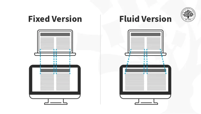
Then comes the fluid design in 2009; the concept of fluid design (also referred as liquid layouts) with accuracy as a solution to adapt to the screen of each device the layout of a web page. One could say that this design philosophy is one of the previous steps to adaptive web design or responsive web design. The idea is to flee the design with fixed sizes defined in pixels and use relative measures in percentages so that they adapt to the dimensions of each screen.
Furthermore, in the year 2010, ‘Responsive Web Design’ was introduced; it was an unravelling the birth of this new technique in response to the problems posed by fluid design. The responsive design is based precisely on adapting the usability of the design to each device.
Collapsing, adapting and even hiding content are the techniques that make adaptive design the best response to the multitude of devices capable of surfing the internet. Scaling the content to “occupy” the screen width as did the “fluid grids” was no longer enough.
Responsive Design Evolved from Fluid Design (Source: Speckyboy, 2017).

Image Source: Interaction Design
This was followed by “One Web” in 2011; adaptive design is considered as a solution to the “mistakes” made so far in terms of designing websites. One must be clear, when web is designed that is not for a particular device, there is no web for a desktop computer or a web for a mobile device.
There is a single content, a single web, on which one has to work to adapt its usability, adapting it to the characteristics of each device. So far, the solution to create sites adapted to each device was to develop independent developments that conform to the characteristics of each device (desktop, tablet or mobile).
The cost of development and the growth of “connected” devices make this way of conceiving a project become unsustainable in the present and is banished in a future in which the users will see an exponential growth in the field of use of web pages.
In addition to that, the adaptable design of the Boston Globe caused a great sensation in the world of web design because it showed that it was useful no matter what type of site was being designed. The perfect realisation and careful design did more than the evangelistic work of avant-garde designers.
The Boston Globe development team explains how they set out their adaptive design and what the steps were to adopt it as a solution in a small presentation that one cannot miss. It is in these years when web designers became aware of adaptable web design as a response to the evolution of the internet in recent years in a massive way.
Difference between a Responsive Website and Native Mobile App
Responsive website or layout, or otherwise known as flexible website is when the site automatically fits into the user’s device (desktop, tablet, mobile).
In a responsive website the appearance or view along with the layout of the site changes in accordance with the screen resolution of the gadget on which the website is being displayed.
Thus, if the user has a small screen, the elements reorganise to show the main things first. In smartphones navigation and user experience becomes difficult and limited having to use zoom in and out features to read the page in its entirety. Other details like buttons and menus are deformed because they were not made for this device or resolution (Kim 2013: 30).
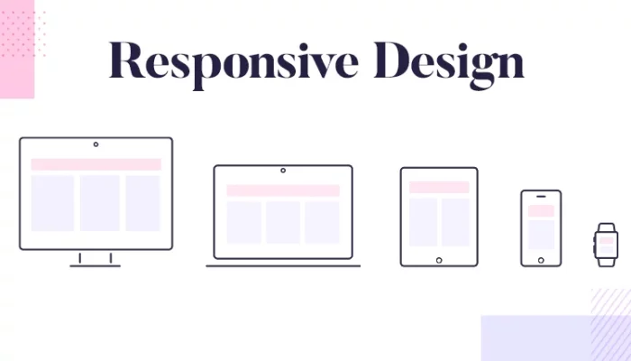
Responsive Web Design (Source: Vrsfoto, 2016)

Image Source: justinmind
The concept of responsive design is not a big breakthrough, but has attracted a lot of attention in recent times with the growth of the mobile device market, mainly due to tablets and mobile phones of varying sizes and resolutions.
In this new context of browsers and various resolutions, responsive design emerges as a logical evolution of website design, also known as web design; before much of the internet was accessed by very similar resolutions and browsers.
Until recently it was enough to make a website that worked in Internet Explorer with a maximum resolution of 1024 × 768 pixels that everything was solved, of course there were other features, but the vast majority was in the same group — at most there were users of Mozilla Firefox.
Today everything has changed, there are 50 “inch TVs accessing the internet, there are phones that have 2” to 5 “screens, 5” to 7 “ tablets, 6” to 14 “(or even more) tablets and not counting the computers themselves, which has netbook screens up to Apple’s iMacs, putting the 11 “edge up to over 26” inches.
All of these screen sizes and still do not enter the question of resolution, which further increases the range of possibility. According to Google Analytics, there had been 1841 different screen resolutions accessing the site in 2014 (Lane et al. 2015).
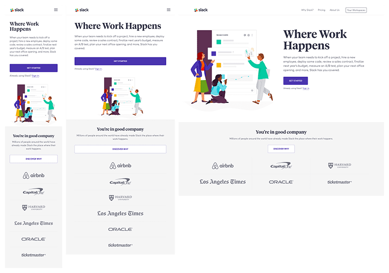
This feature demonstrates that a site can be viewed in a variety of ways and in a variety of contexts, and that is what sites should be prepared for*.* The responsive design, as the name already indicates, can respond to the size of the screen to suit the best. An example of the layout change of a responsive website can be seen from the image*.*
Instead of creating two separate sites, one for mobile (cell phones and tablets) and one for desktops, the designer can only make one website that will fit nicely on any screen it loads on. Almost 20% of the 10,000 largest sites in the world use responsive design. Either a responsive website is made or ten different websites are to be made.
Responsive Web Design (Source: Caktus Group, 2017)

Image Source: slack
One of the key advantages of responsive design also becomes a major problem for digital agencies. If there is a need of the site to be tailored for mobile phones, smartphones, tablets, notebooks, desktops and TVs, the designer would probably have to make at least 5 different websites.
The evolution of responsive design has greatly changed this, bringing the advantages of having several sites to one place. But this ease of adaptation also creates a problem for digital agencies and all those professionals who work on website development.
Mobile platforms have become important tools for marketing products via e-commerce, and so the entrepreneur must have a responsive website. Responsive sites are those that adapt the size of the pages (layout change) to the size of the screens that are being displayed, such as the screens of mobile phones and tablets. Its advantages derive from adapting to any tool that users are using to make their viewing easier. In addition, responsive sites can also expand to view page details by zooming in.
Basically, responsive sites are adaptable with all the screen sizes, not only for mobile phones, tablets or desktops, but also for internet browsers that are not screen-maximised. In summary, they are sites that fit the viewing area.
A responsive website fits the screens and repositions the elements and images of the website in order to keep a vertical scroll only, and make it not have the scroll bar horizontally. The sidebar with menu or login of the website are repositioned automatically.
The three main ingredients of Responsive Web Design (Source: Verve Search, n.d.)

Comments.
h
My brother recommended I might like this web site. He was totally right. This post actually made my day. You cann’t imagine just how much time I had spent for this information! Thanks!
Sven B.
Great article, very informative. Thank you for sharing.