Uniti.

Overview.
Uniti App is a project with the objective to reduce the impact of loneliness on the mental health of students. The aim was to empathise with students and to understand their needs by doing online surveys, personas and user journey maps.
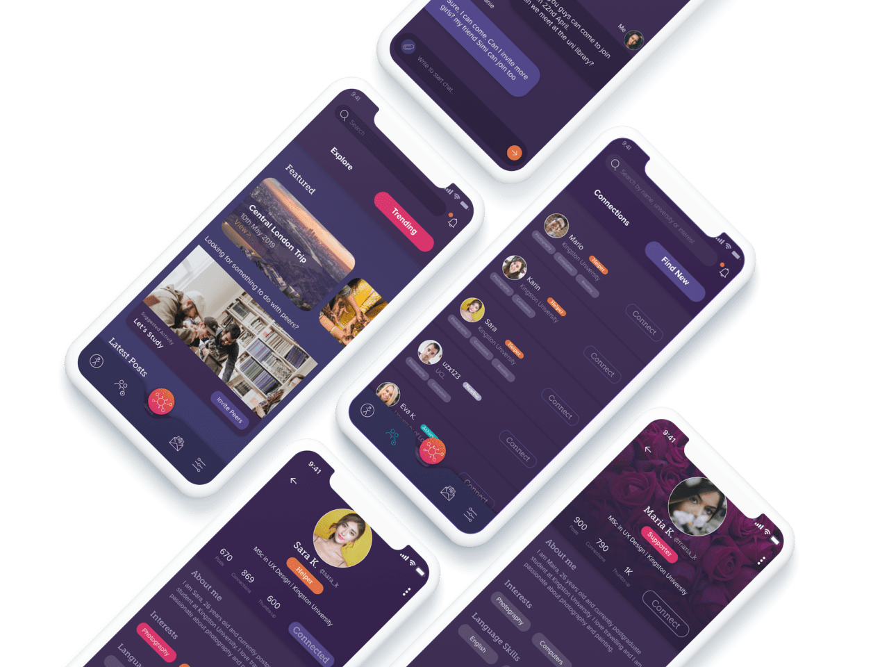
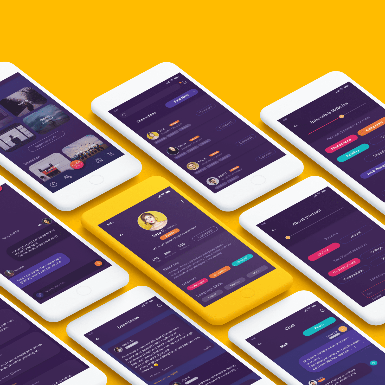
The Uniti app allows students to get connected with others even before joining the university, and to learn from each other beforehand. Another design aim is a solution for isolated students to share their feelings anonymously with trained staff and peers without feeling of being judged by others.

The Brief.
An online survey conducted by BBC Research found that loneliness affects young people ages 16 to 24 years the most. Another recent research by the Red Cross found that 32% of young people (between 16-24 years) in the UK reported that they had often or always felt lonely in the last two weeks. (Thersa.org, 2019)
Young people leaving home for the first time are likely to experience feelings of isolation or loneliness. While this is often temporary, it can become an issue of concern for some young people. (Knight et al. 2006; Gentleman 2009).
A recent report suggests that people who feel lonely suggest having a better understanding and empathy for others who experience loneliness or unfairness.
The study also suggests that people who feel discriminated against are more likely to feel lonely, and the levels of loneliness are much higher “if people are made to feel that they are different in a negative way”.
Aims and Objectives.
The project’s objective was to define a clear target audience, and the aim was to focus on international students. According to a published report, about 750.000 students each year come to the UK for their studies. (Impact of international students in the UK, 2018)
The primary aim of this project was to understand the experience and emotions of young, international students and reduce the impact of loneliness on the mental health of students.
The research intention is to examine how the solution can help the affected students and create a platform for individuals who are struggling with loneliness and anxiety, even before and after joining the university and moving from their origin country to the UK.
During the primary research, the aim was to empathise with students and understand their needs and concerns by doing an online survey, personas, an empathy map, and a journey map.
User Research.
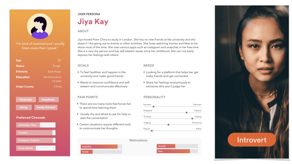
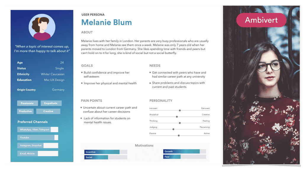
My initial user research, secondary research, and primary research were used to analyze the persona data in order to gain empathy for the users. A total of three personas (students) have been identified and designed in Sketch from scratch. It is imperative to note that each person has different needs, goals, and pain points.
Competitor Analysis.
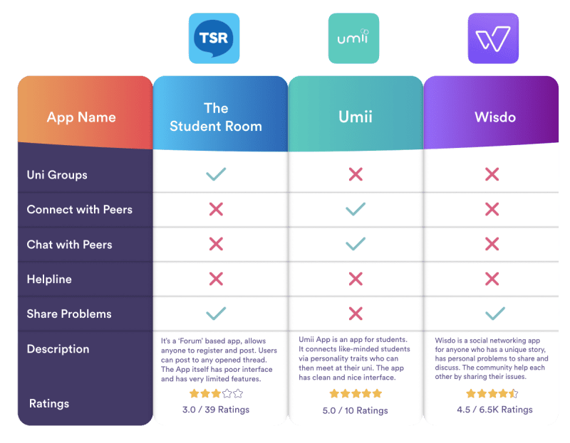
The competitor analysis is collected from online research and bespoke UX method from the user research outcomes. Users’ reviews were obtained from the App store ratings.
Umii App
The Umii App is a social networking app for university students. The app connects “like-minded students via personality traits”, who can then meet at their university. However, the app only shows the matches of students from the same university and allows syncing a new match result after at least 48 hours.User’s Feedback: “This is a great idea with a really good interface and will be even better when more people join and interact on the app!!”
Wisdo App
Wisdo app is a social networking app for anyone who has a unique story to share. Users can register and discuss their personal problems and sensitive issues. The Wisdo community aims to help others by sharing and discussing problems. However, the app is not moderated by any trained member, and bad advice provided to vulnerable people can harm them badly.
The Student Room
The Student Room (TSR) app is a forum-based website and an app for iOS and Android users which allows users to post in a thread. Although the app has a feature of sending instant messages, a live chat feature is missing. The app has a poor user interface, and searching for a keyword does not work properly.
empathy map.
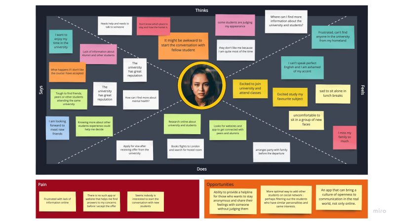
The empathy map was created to gain a deeper insight into the student’s thinking, feelings, worries, and aspirations.
User Journey Map.
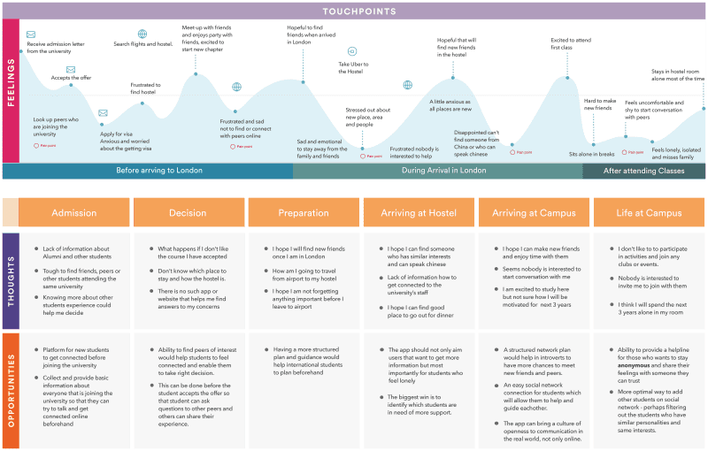
This journey map represents a timeline of an introverted student’s actions and visualising the details of all of the touch-points she comes into contact with while attempting to achieve a goal, as well as the emotions she experienced during that journey. The journey starts in China, when the student received her admission letter from the university, and the journey ends after she attends her first class.
User flow map.
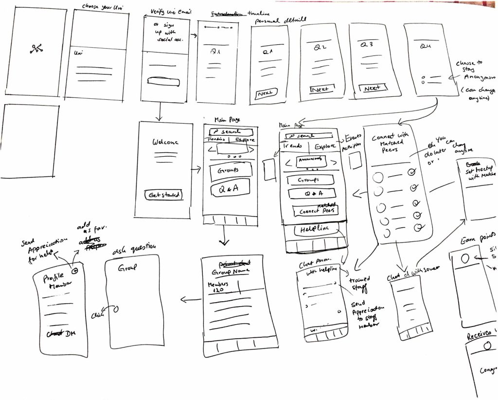
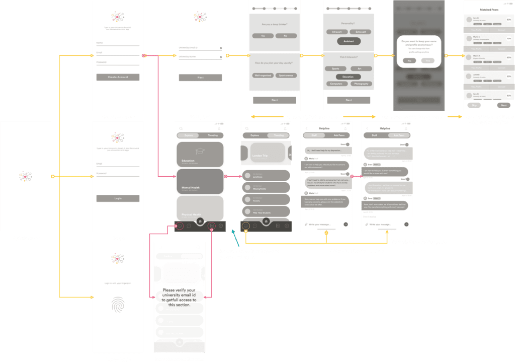
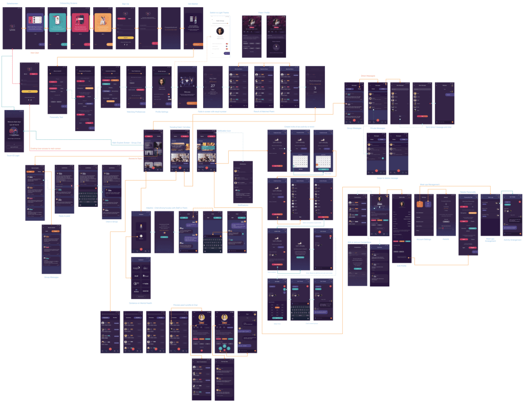
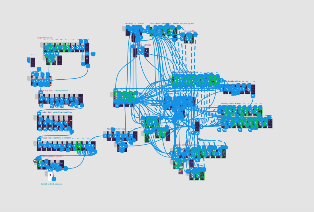
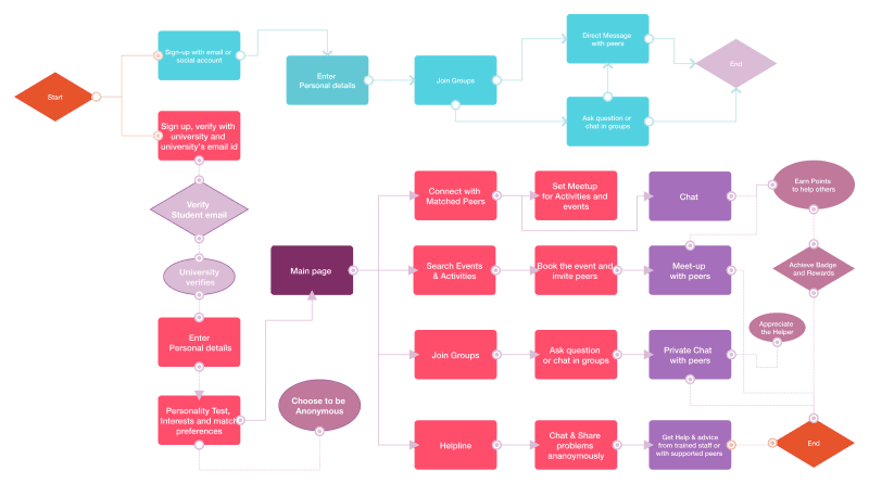
Flow maps are useful and simple ways of mapping out the possibilities that may involve an app’s full experience. The User Task flow shown below reflects the four aims of this project.
The first aim is to allow users to join groups before accepting the admission offer. The second aim is for verified students to get connected with their personality-matched peers. The third aim is access to the helpline with trained staff and supportive peers. The helpline feature also allows users to chat anonymously. The fourth aim is to implement ‘gamification’ – a reward technique to enhance user engagement with the app.
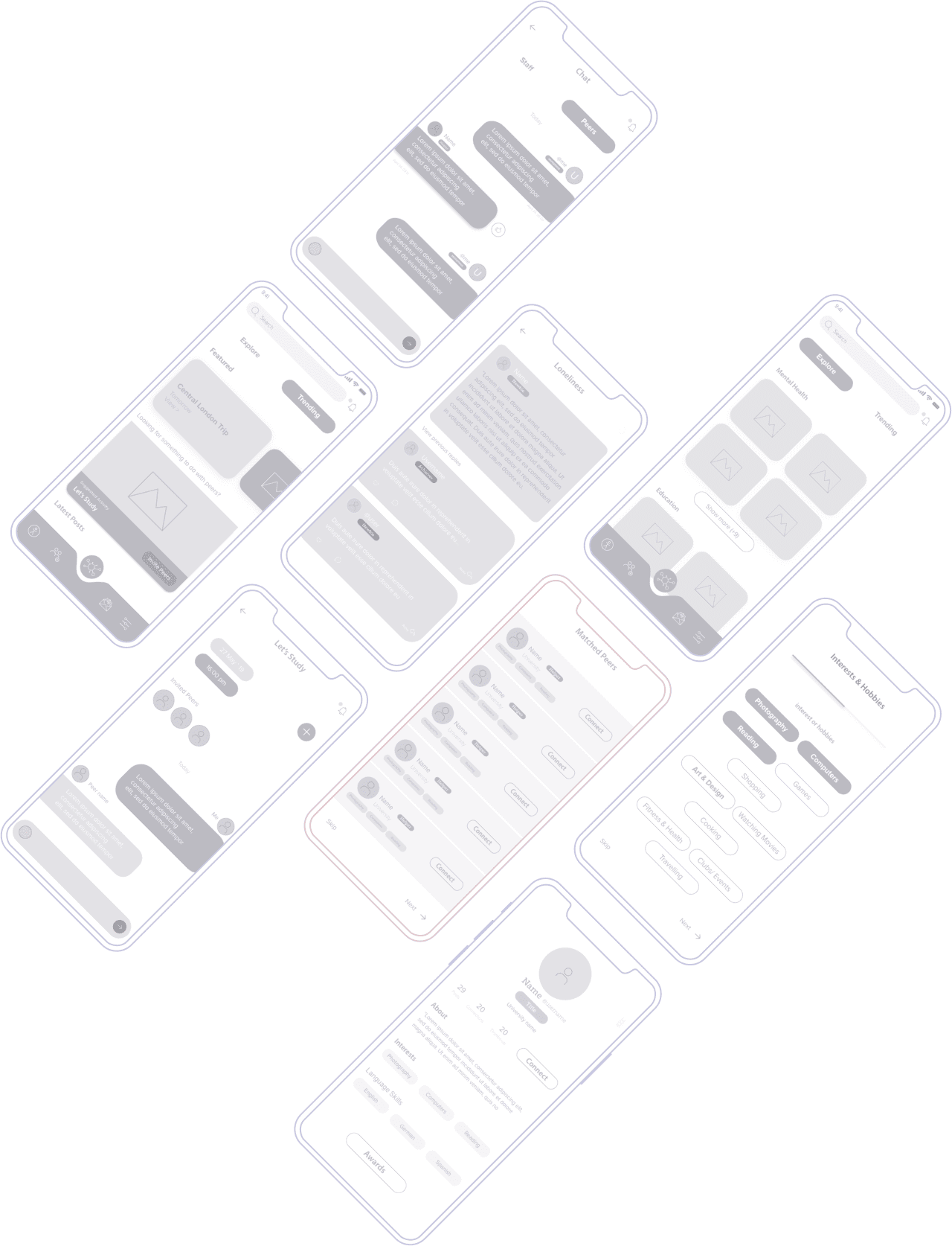
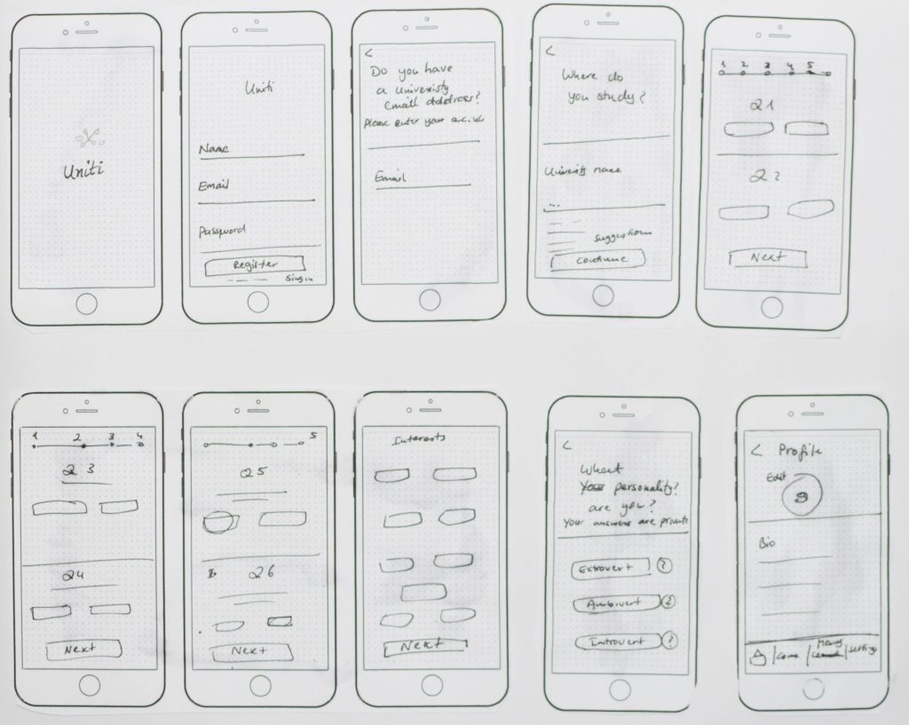
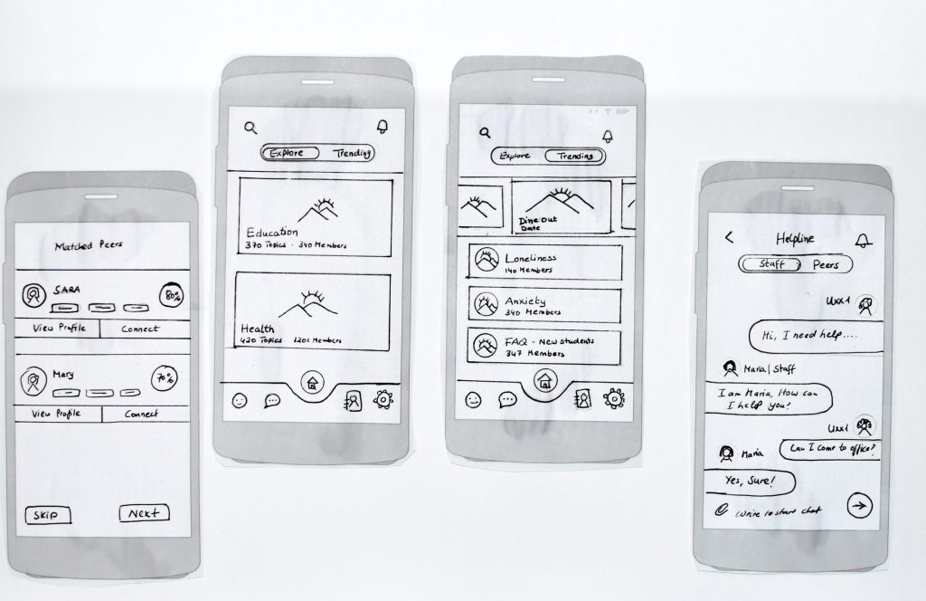
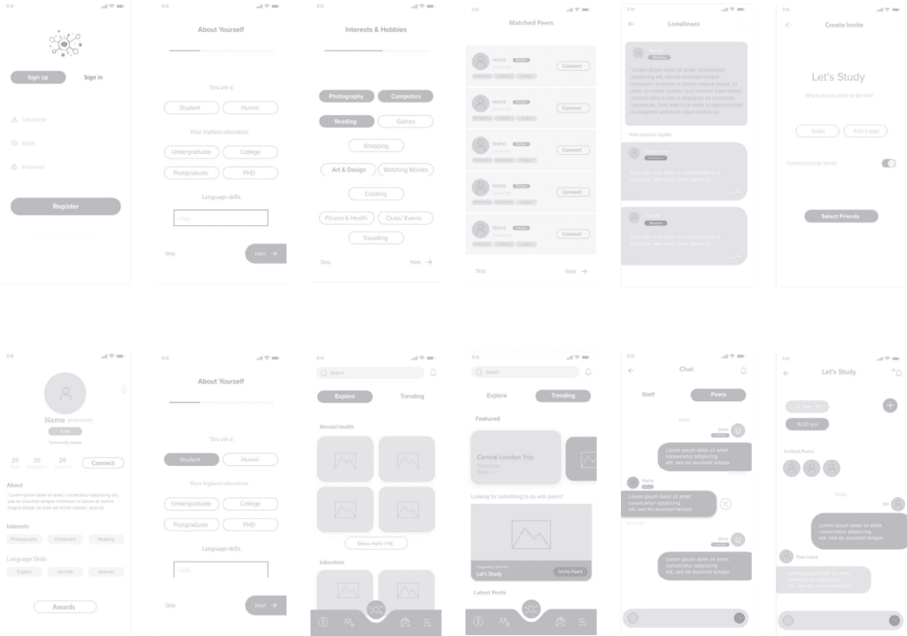
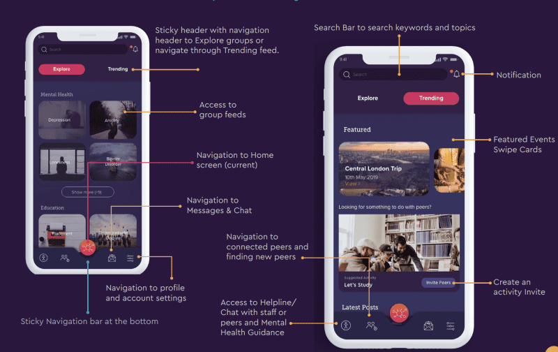
low-fidelity prototype.
low-fidelity wireframes.
Design Rationale.
I followed the latest Material Design guidelines. The approach to design principles from Google Material Design is very minimalistic and focused on what makes Material Design unique as a universal design system.
Formative Evaluation.
The Uniti app project focuses on the mental health and well-being of students. It has been a very challenging project that required many detailed decisions. The outcomes are researched and include an overview of the results which has been obtained from surveys, personas, empathy maps and user journey maps.
Other factors considered include psychology, environmental pressures, demographic issues, and many other contributing factors. When looking at these issues objectively, it becomes clear why human mental health is impacted so negatively. It also becomes possible to understand and empathise with the reasons why international students struggle physically and emotionally while moving to a new place.
It has been a very challenging project to analyse all of the problems and find a suitable solution. The literature review also played an important role in this project.
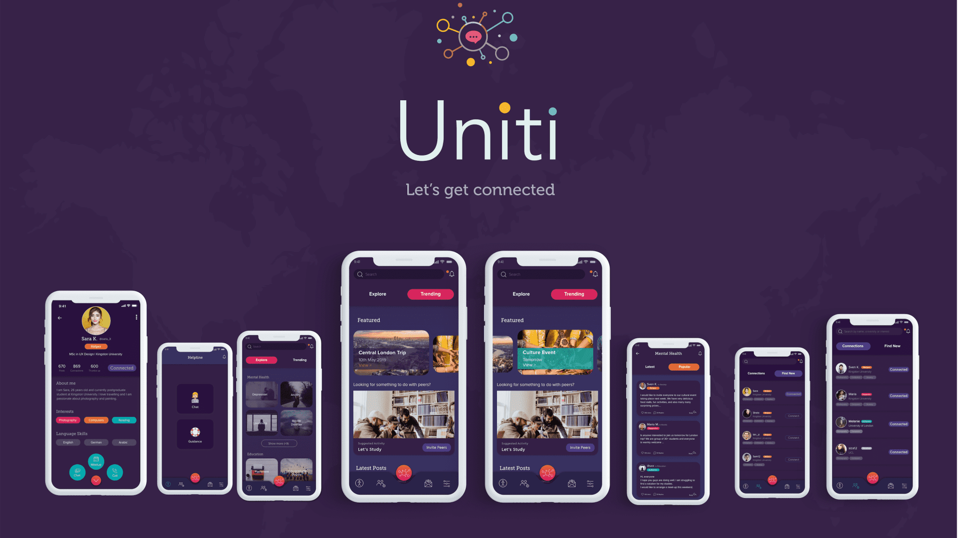
The main contribution made in this particular project is the visual approach in presenting the user experience content. Throughout the development process, consistent visual elements were created to make sure UI elements are consistent throughout the app.
The content, UI elements, fonts, backgrounds, and colours are designed consistently. The branding and style guide was followed by every design decision. User Interface elements that are commonly used and that are consistent and widely understood by users were considered for this project.
The design process of this project was an innovative solution with a user-friendly, minimal interface, in order to ensure broad appeal to the target users. The final prototype has been developed by refining multiple design solutions and then testing the app multiple times.
Throughout the process, many new technical skills were learned. It is extremely rewarding to know that a viable solution for the problems of the target users is discovered.
While informal interviews were concluded during the research phase – gathering more data as the “User diary” – have not been investigated due to time and resource constraints.

